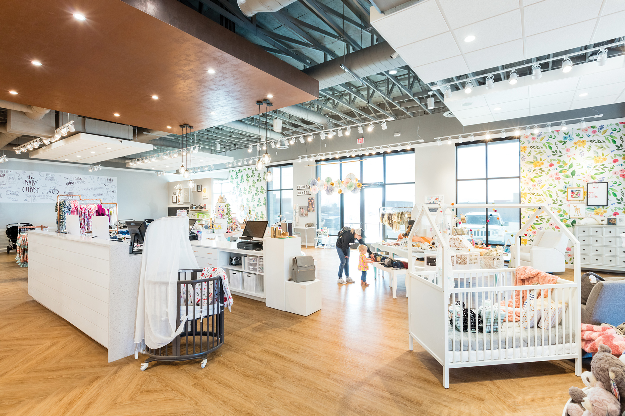
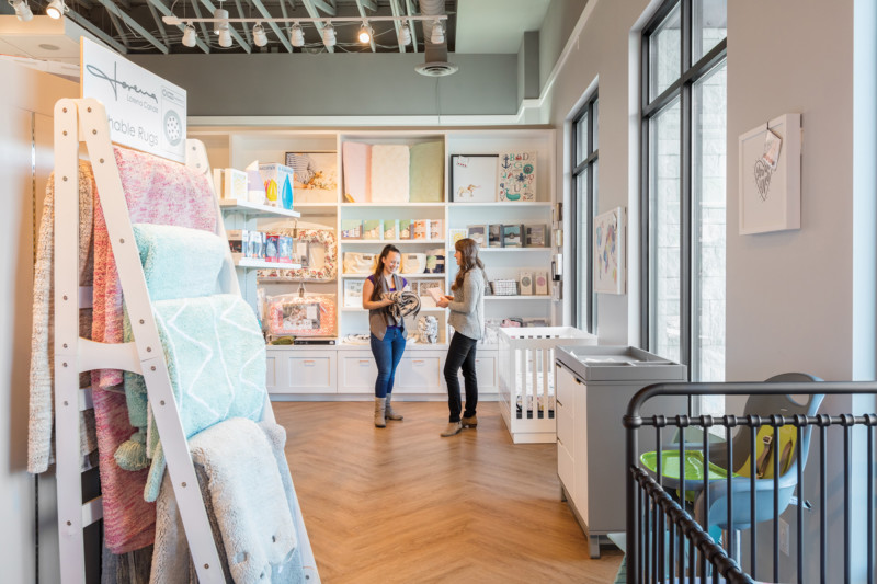
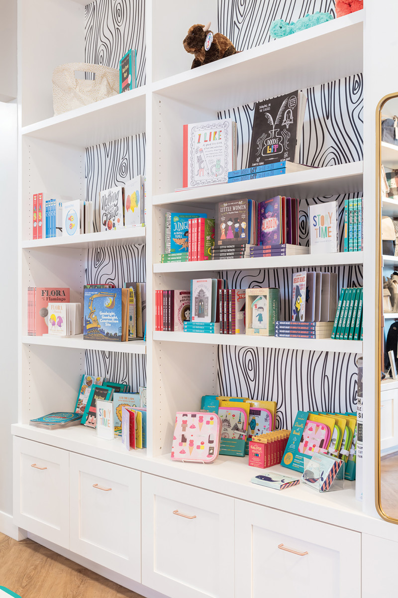
The Baby Cubby has an established on-line presence and sought to create a storefront to better serve their clientele. Working with their existing brand standards, our interior designers implemented inspiration images and ideas into their new, larger space. We carefully studied how the store was to function and created zones for different activities and experiences to make both managing the store and shopping a delight. Clean, white custom millwork was designed to highlight special products and allow display for hanging and folded pieces. Adjustable shelving was included to rotate seasonal product, all with base drawers for storage.
A key design element is a faux copper dropped ceiling centered over the cash wrap. It is a stunning focal point customers see as they come in the front doors. Additional unique and special areas include a stroller terrain track, kids play area, a tiered stuffed animal display, and a beautiful diaper bag wall display.
The Baby Cubby hosts evening events to bring the community together in learning and teaching about different products, techniques, and creativity. The store was designed to be flexible in functionality to accommodate these evening events. It was beautifully executed for all these special and unique experiences for the customer and employee alike.
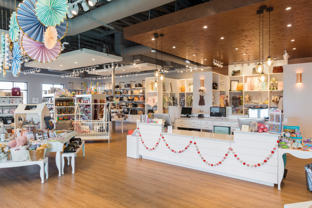
Simple Elegance
The Baby Cubby was designed with parents in mind. It is a space that encourages parents to find the joy in being the best parent they can be. The design intent was to keep the majority of the interior clean, classy, and simple to let the products become the show pieces.
Function Over Form
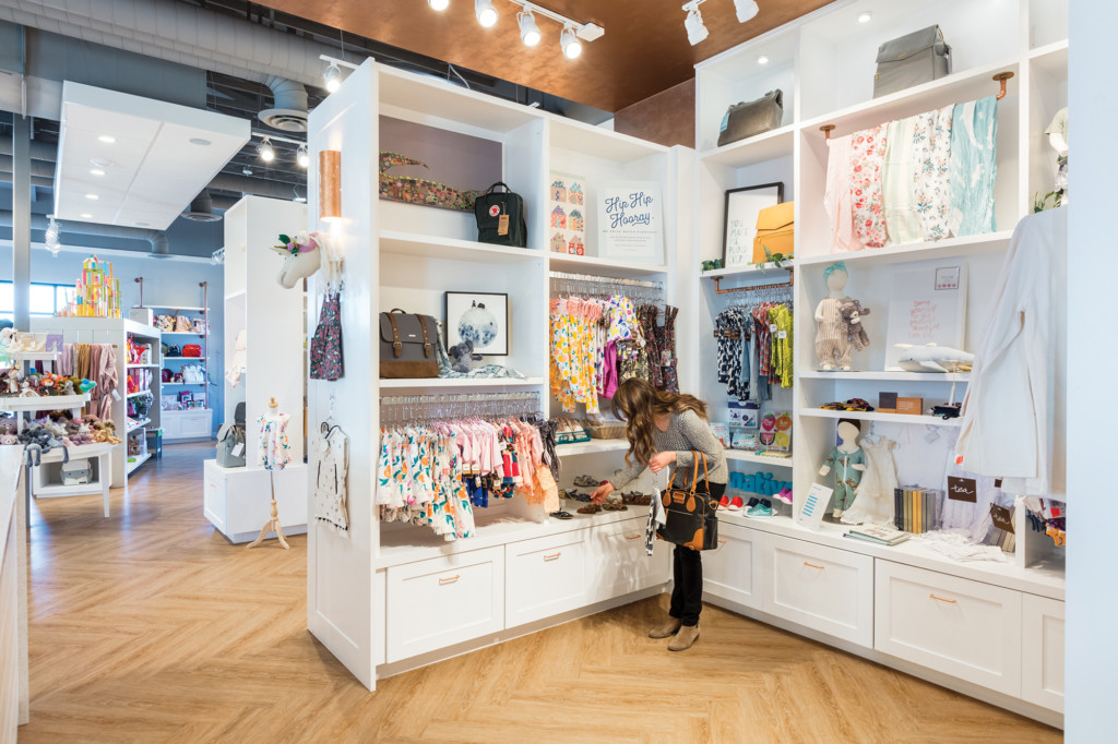
While the goal was to keep the design clean and classy, a lot of design time went into studying the best way to display, showcase, and store products throughout the store. Large, white, custom cabinets became the answer. They line the back walls and create beautiful shopping “zones” for the customers.
Creative Displays
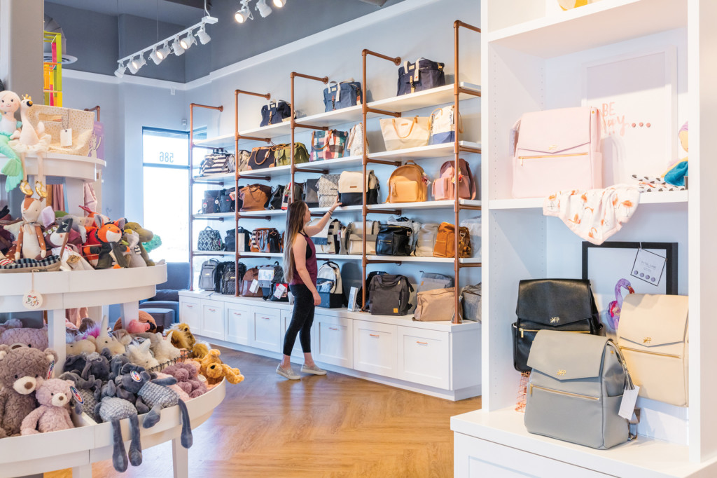
One of our client’s favorite parts of their warehouse storefront was the diaper bag wall built from white wood planks and copper piping. Implementing it in a larger scale for their new retail store was an exciting element to bring to life.
Classically Trendy
The owners and design team had very similar visions when it came to finishing the space. We focused on classic-looking elements like a wood-like floor and white cabinets, but paired them with fun, trendy accents like glass pendant lights and patterned tiles in the restrooms.
Community Focused
While the main focus of The Baby Cubby is a place for parents to shop and be educated on products for their family, they also host community events and showcase other local vendors throughout the store. Flexibility in design was a crucial part of the process to allow these functions to happen.
