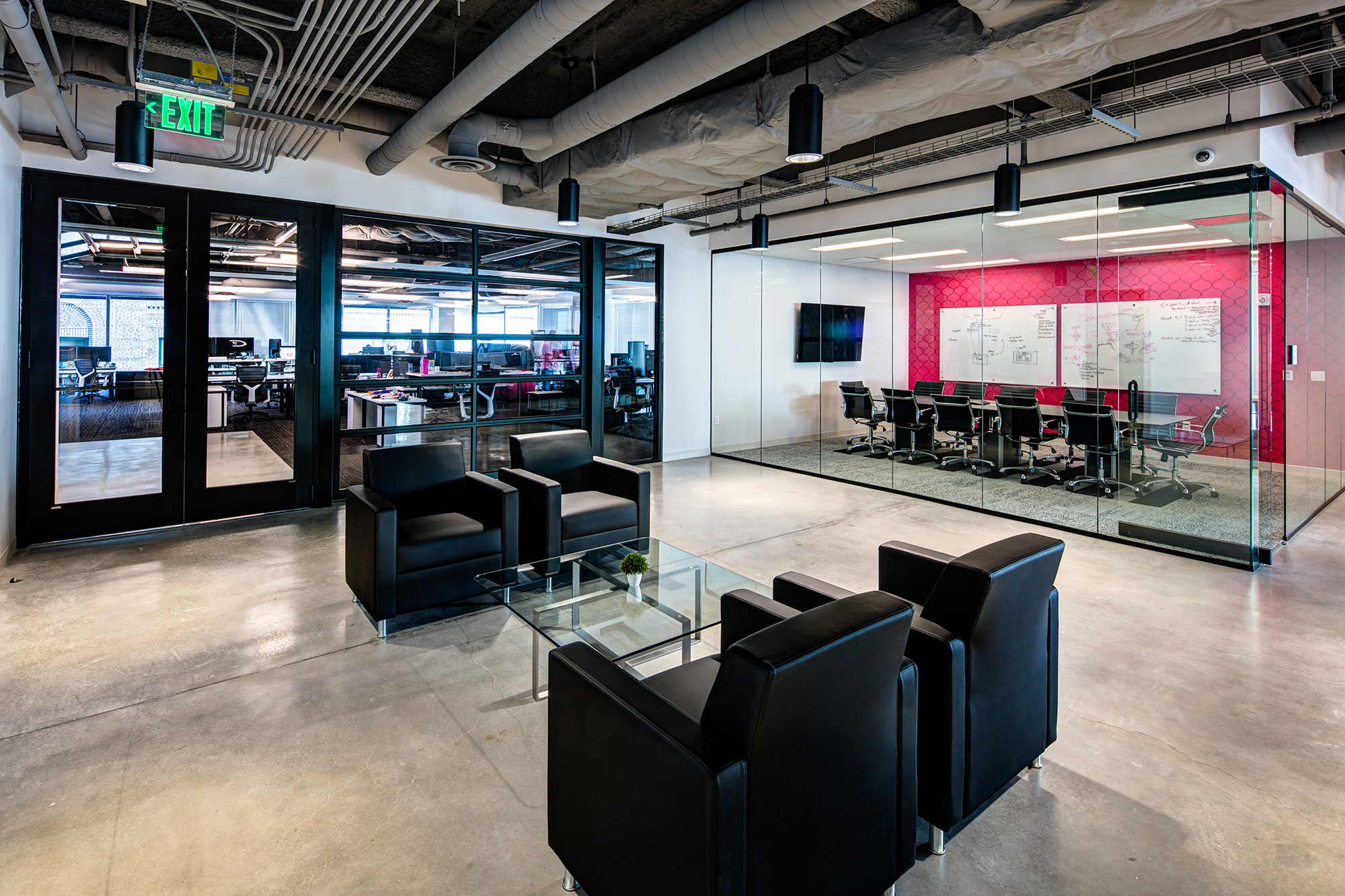
The goal of this interior design update was to incorporate several additional features desired by the owners, cohesively, into the existing, classy environment. With market positioning that included natural ingredients, pampering, and simplicity, the interiors needed to reflect these values in the surrounding business environment. Perfectly Posh, like other hip young companies, needs to offer employee amenities that will support staff retention and foster a work culture of creativity.
The design solution showcases the brand beautifully. Sealed concrete floors, exposed ceilings, and wood veneer walls provide a cool backdrop for bright pops of color and bold, wall covering patterns placed throughout the facility. Posh’s mix of private executive-level offices and open office collaboration spaces were rearranged to maximize access to views and daylight
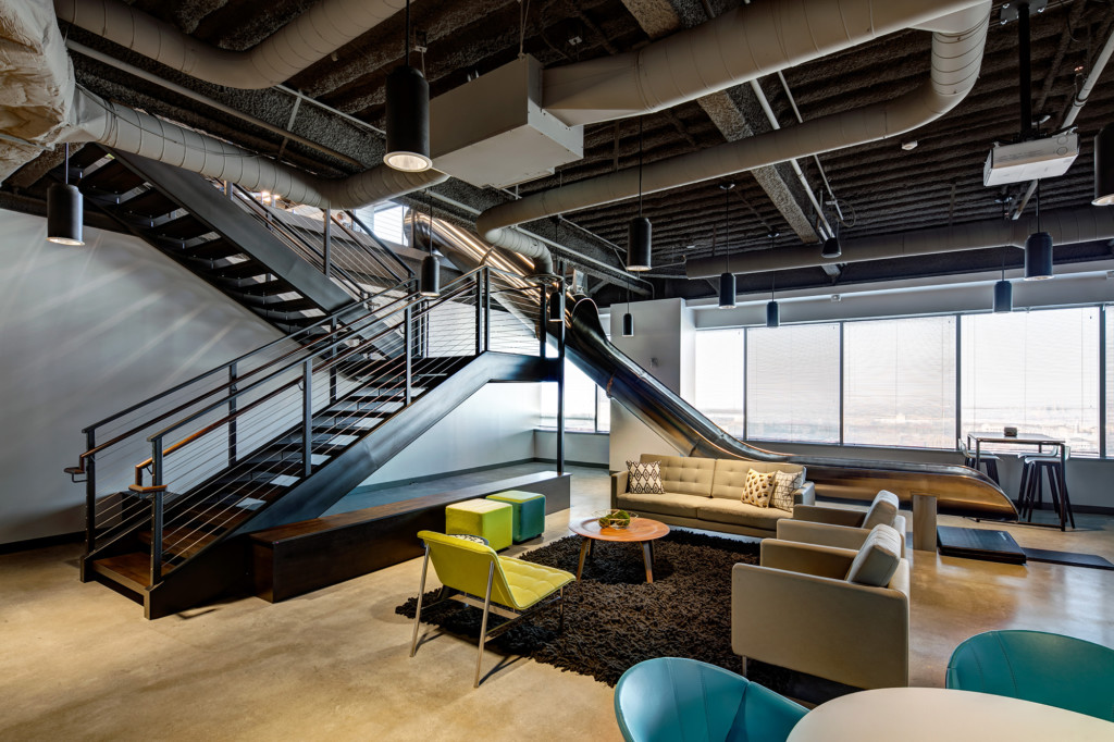
The remodel includes a variety of informal meeting spaces that encourage collaboration. The fun takes a role in this upgrade, with a slippery slide from one floor to the next, ending in the break room space. Tiered seating and stairs next to the slide activate and energize these circulation spaces. A garage door separates product developers from administrative staff. These “creatives” also have their own game room for unwinding during breaks.
Natural light was a priority for the client from the start and interior glazing systems bring desired passive heat gain and light to the core and open office spaces while taking full advantage of the building’s 360-degree views. Paint and finish materials chosen were low-e. Use of the existing facility slab was a deliberate choice. These sustainable design choices enhance the overall progressive effect of the makeover beautifully.
Formal Meets Fun
The employee break area was designed with two objectives in mind, a space to gather, meet, and collaborate, and second, a place of fun. The stainless steel slide transports employees from a formal work space, quickly into this break area. The vibe of this space was intended to stay sleek and minimal but depart slightly from the branded areas.
Modern Elegance
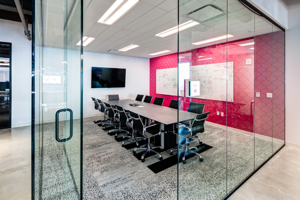
All formal meeting rooms are a depiction of modern elegance. The bright wallcovering highlights the brand, while the simple textured carpet, paint, and furniture looks clean and refined. The ‘glass box’ allows light to flow to the inside while accomplishing divided space.
Luxury and Elegance
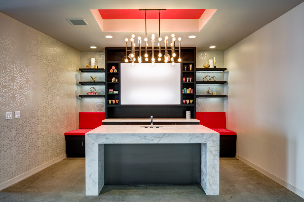
Located at the entry of the Perfectly Posh Suite, this area was designed to host new product launches, media staging, and informal employee gatherings. With luxury and elegance in mind, the beautiful stone, metallic wallcovering and stained wood create a rich, indulgent spa experience.
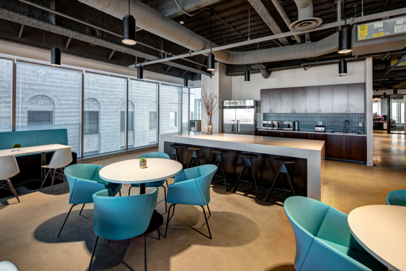
Departure from Pink
Departing from the regularly pink branded areas, the break room was designed to hold entire staff meetings and presentations, while allowing regular break area functions daily. The open concept and views allow natural light to fill the space.
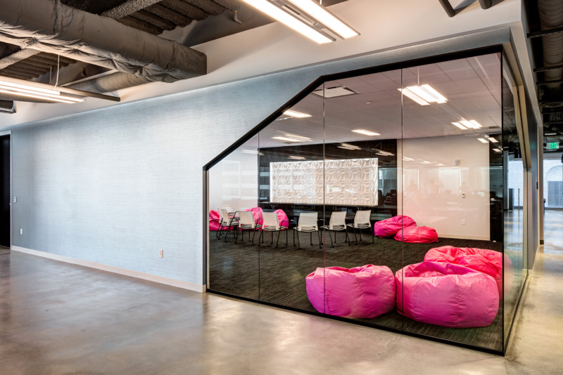
Perfectly Posh Culture
The large conference room gives a little peek into the Perfectly Posh culture. The angled glazing adds interest, while the cushions provide comfort. Elegance, indulgence, and luxury are shown throughout the space with minimal nods to beautiful angles, strong contrast of light, metallic wallcoverings, and dimensional wall accents.
