When Swedish brand Oatly approached FFKR, they were looking to embark on their first full production U.S. facility. During the early stages of the project, FFKR strategized with Oatly U.S. to provide a space that reflected their brand and enhanced their manufacturing process and distribution. Working with the client was critical in understanding their equipment needs for production.
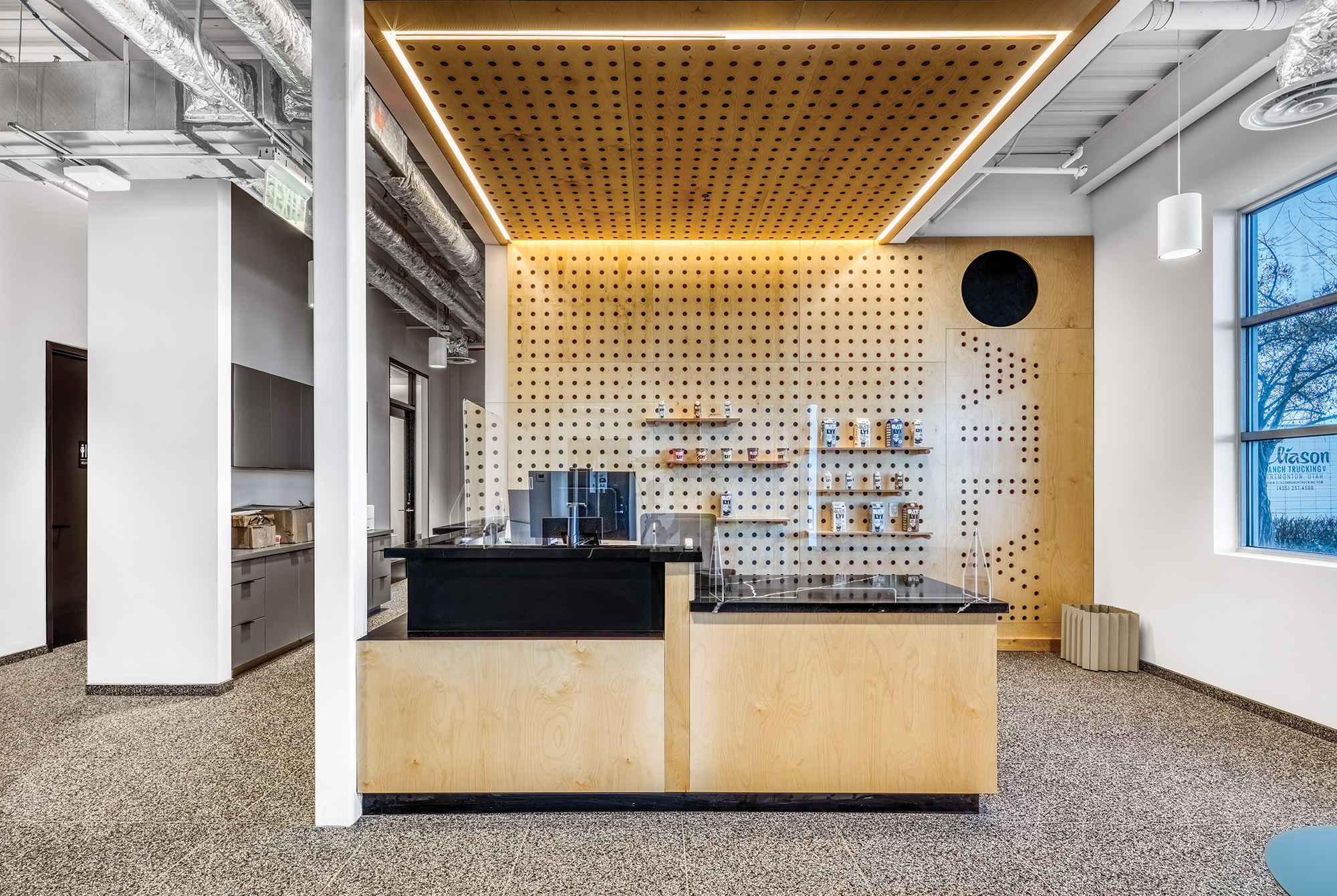
Oatly is known for their oat milk, strong branding, and forward way of thinking. The space was designed to be minimal, monotone, and European in design to reflect their brand. The spaces designed included offices, shipping/receiving, conference rooms, large breakroom, locker rooms, cleanroom gowning, labs, and manufacturing space. The design was inspired by retro 70s colors and shapes, including yellows, golds, and blues. Wood is used as a key design element throughout the space to reflect the sustainability and green focus Oatly represents. Adding flair to their public spaces, FFKR created peg board displays, wheat shaped division panels, and retro restroom designs.
The level two mezzanine was added as the main employee area—locker rooms, breakrooms, offices, conference rooms, and access to manufacturing. The main floor contains the public reception, taste testing area, conference rooms, and offices. The rest of the building holds the lab and manufacturing processing.
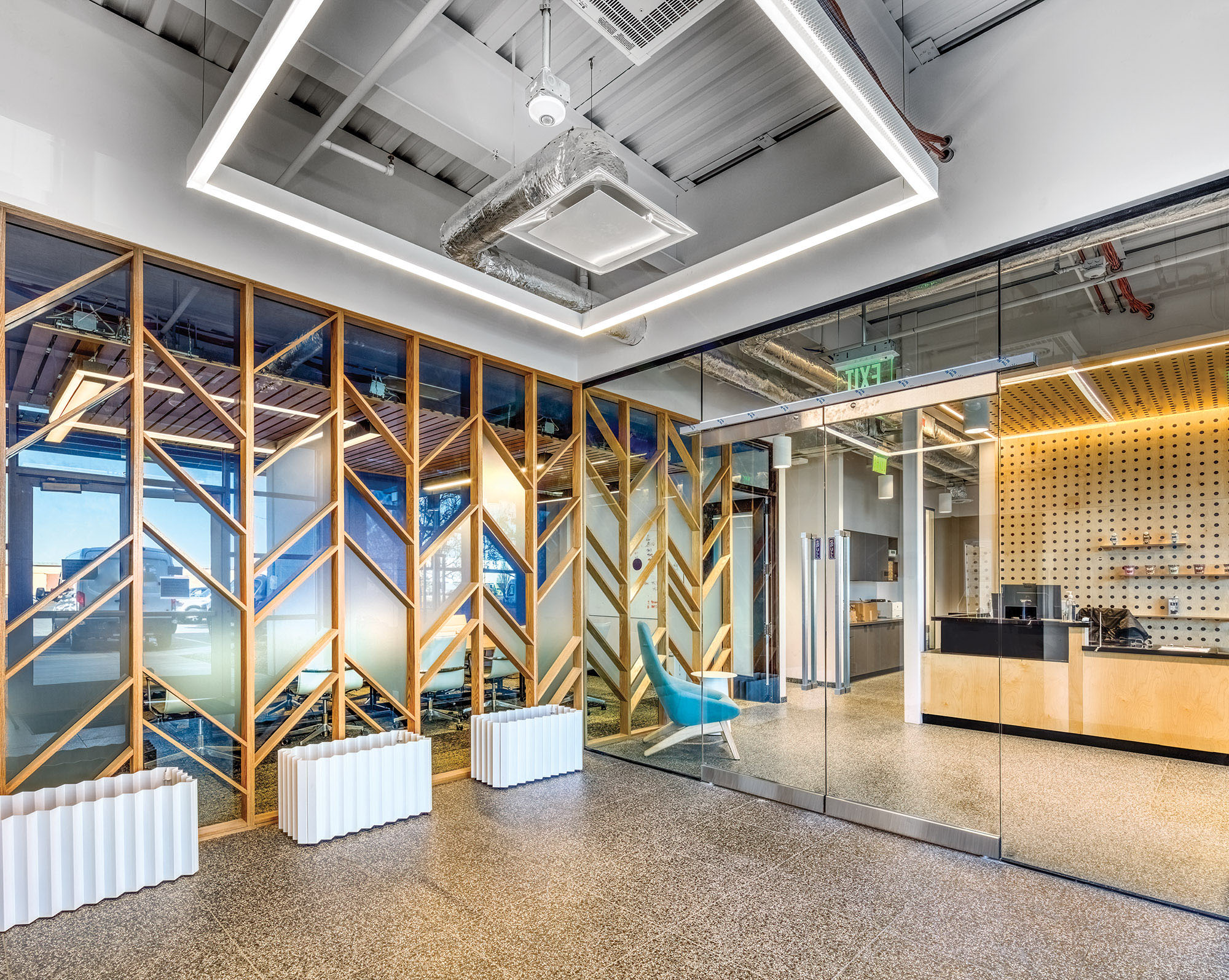
Retro Inspiration
The design aesthetic was inspired by retro 70s colors and shapes, including yellows, golds, and blues.
Continuation of a Strong Brand
Oatly’s space was designed to be minimal, monotone, and European in design to reflect their brand.
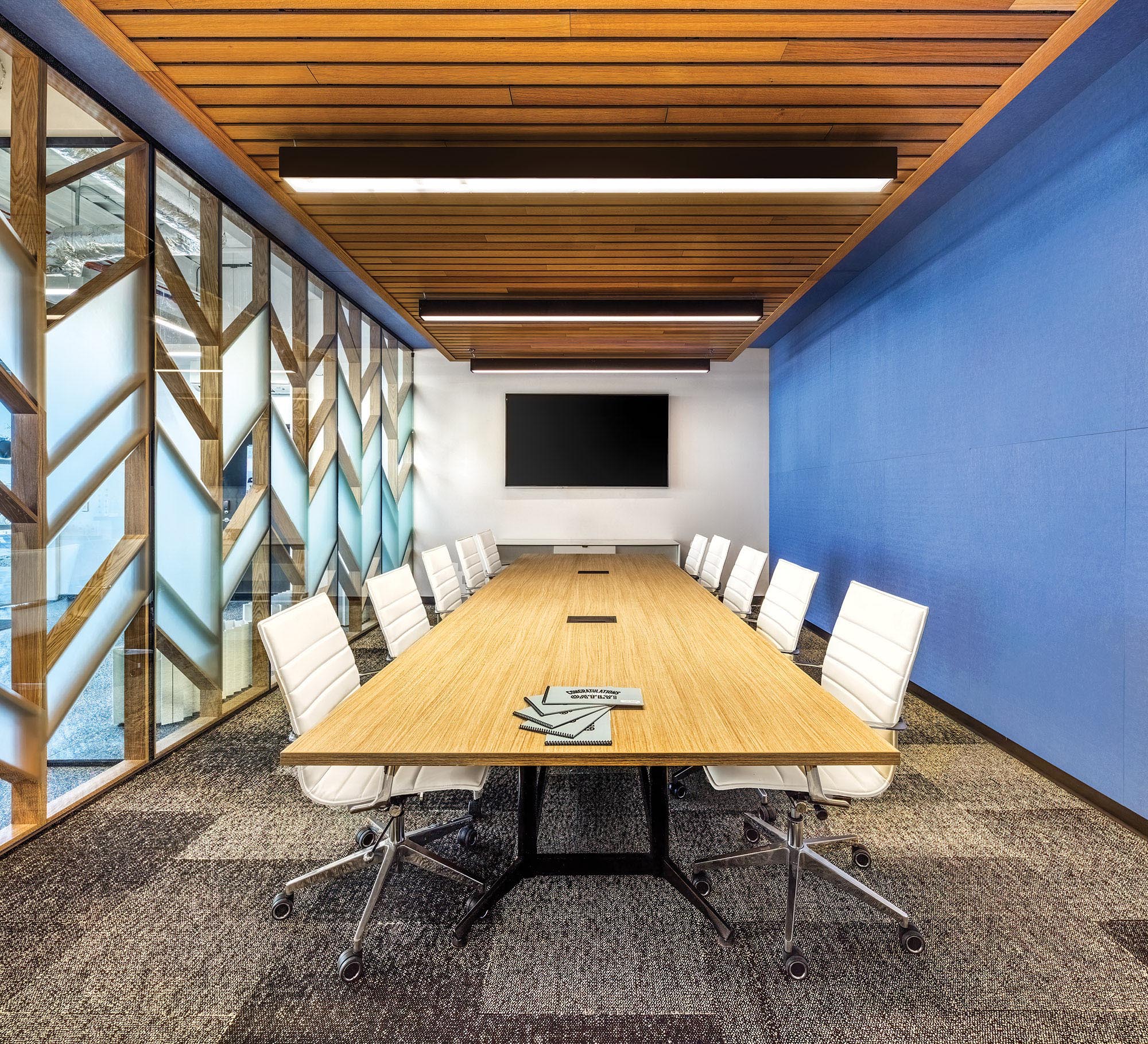
Large Conference Room
The conference space showcases a custom wood panel abstracted from natural grains design, reflective of the products Oatly produces.
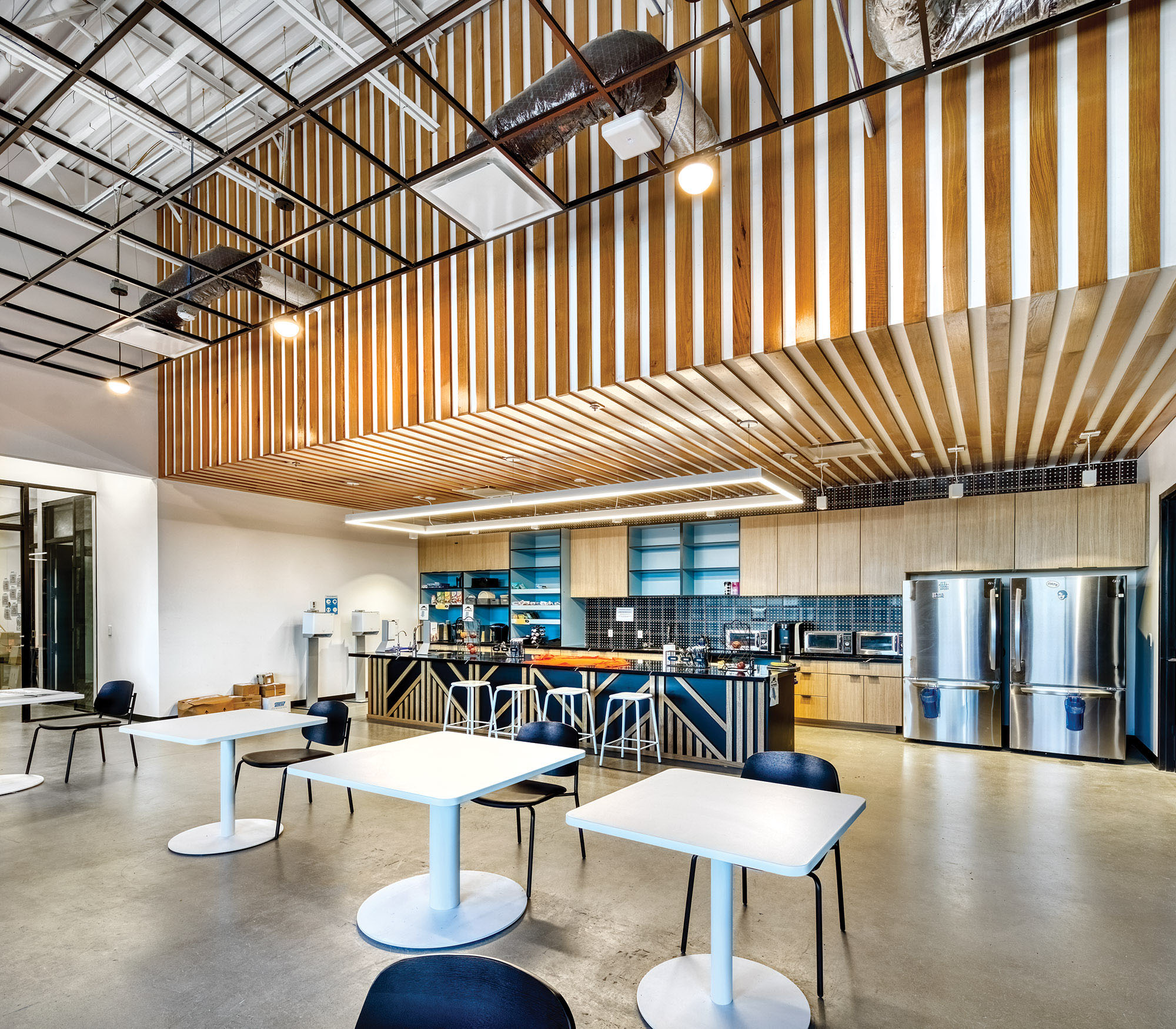
Employee Breakroom
Wood is used as a key design element throughout the space to reflect the sustainability and green focus Oatly represents.
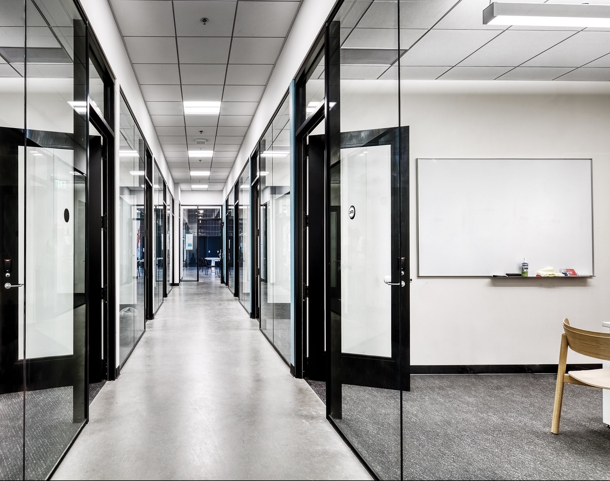
Corridor
The frameless glass was installed to maintain a light and open space.
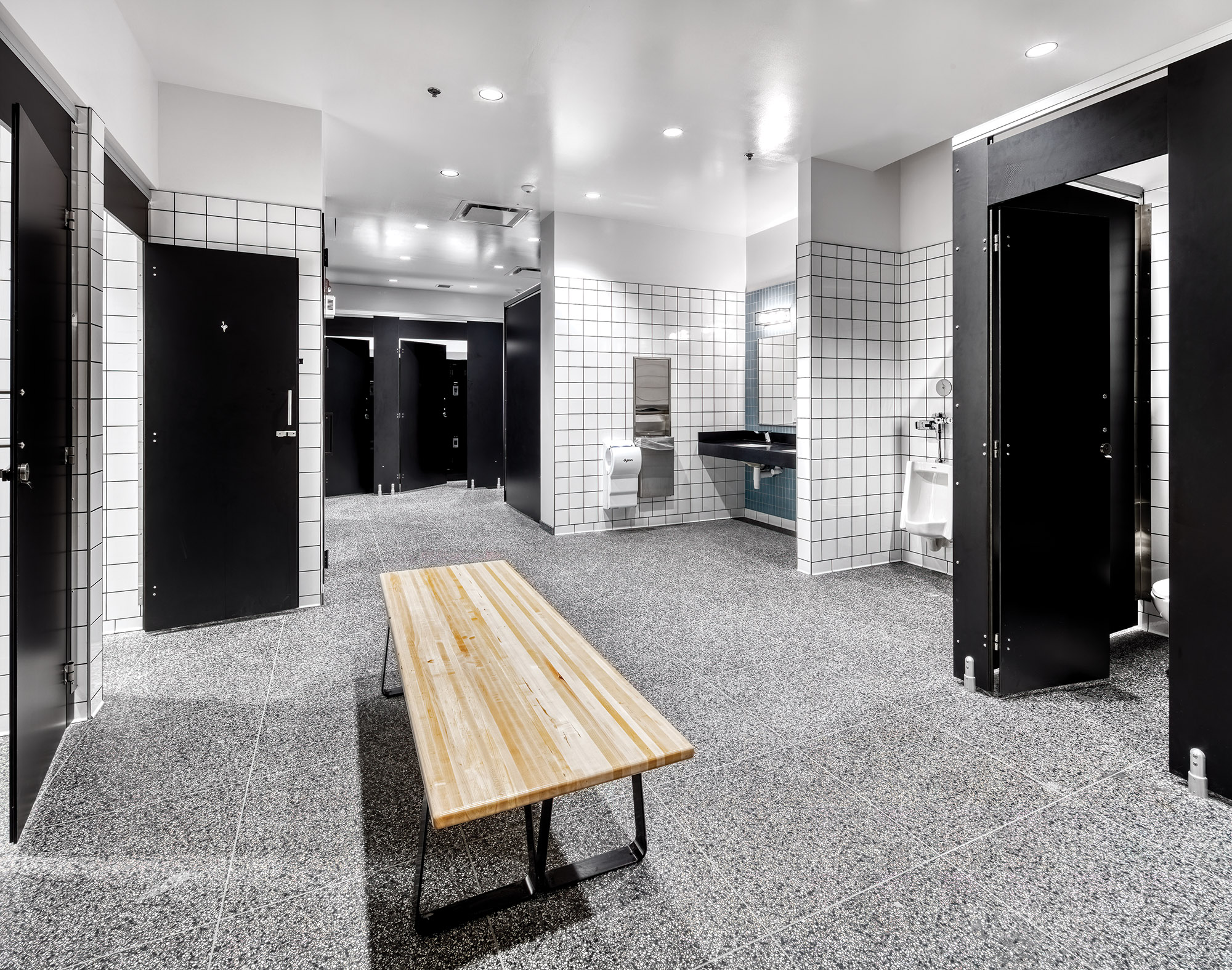
Restroom and Showers
Employee changing rooms were designed to be clean and inviting, with a high contrast of black and white within a square module.