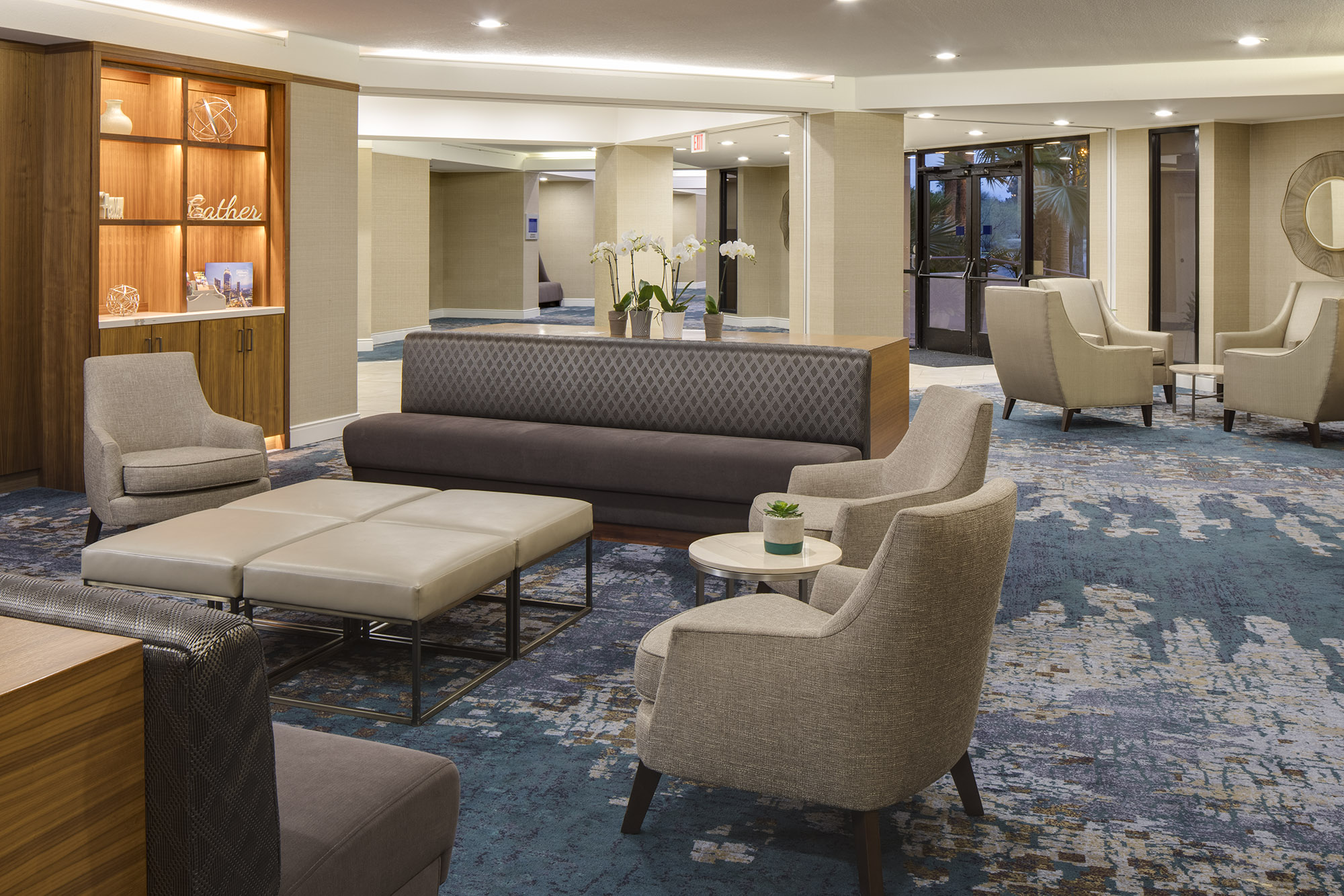
FFKR Architects Hospitality Studio designed updates to the hotel lobby, conference space, guest suites, and restaurant and dining areas. The objective of the public areas remodel in the Hilton Tucson East Hotel was to provide a functional, yet elegant space that will graciously welcome their guests, however long their stay.
Being mindful of the concerns of the property managers, the public spaces, and guest rooms are designed to be convenient, comfortable, and abiding throughout their daily use. A sense of timelessness has been achieved by implementing clean lines while also focusing on durability. A neutral palette with pops of color gives the redesigned interior spaces a new-found freshness.
Guest Reception
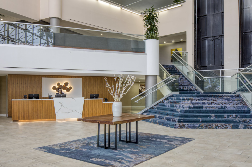
The existing hotel guest reception desk was tucked back behind and underneath the mezzanine with no clear direction for the arrival of patrons. FFKR’s team brought the desk towards the front and reoriented it to match the angle of the mezzanine above. To ground and light the desk we added a custom large light fixture art piece with matching walnut wood. The main staircase remained in the same orientation but we refreshed their appearance with the clear class railings and wool Axminster carpet in the color of the desert, stones, and gems of the area.
Gift Shop Conversion
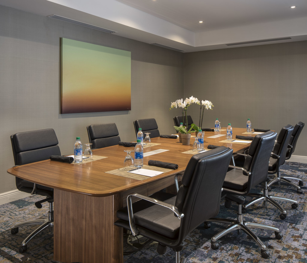
Removing the existing hidden gift shop and storage room we converting the space it into a transparent conference room easily accessible off the hotel parking lot and separated from the guest lounge space with a large glass wall.
The Mezzanine
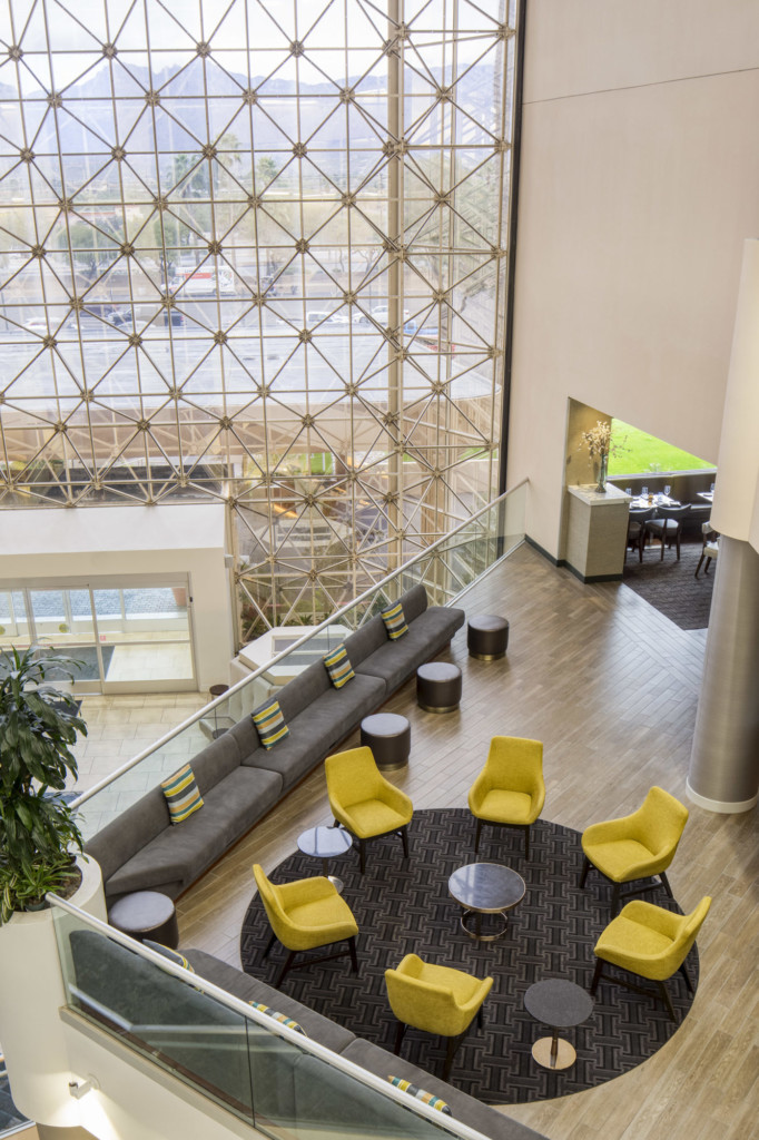
Before the remodel, the mezzanine was walled off from the adjacent bar and restaurant and severely underutilized. By removing the wall and connecting the space the mezzanine and adding banquet seating along the railings with electrical outlets and C table, this space became a causal place to work or socialize. After the renovation the hotel noticed increased food and beverage sales.
Alloro D.O.C Italian Trattoria & Chophouse
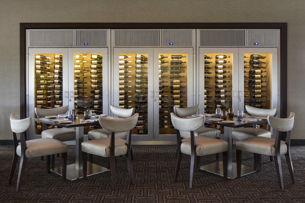
When the wall between the mezzanine and restaurant was removed the space became very open, inviting and visible to guests from the lobby floor on arrival. The bar was brought forward and, inspired by the area, a mid-century modern, touch of whimsy was incorporated into the circular patterned tile bar face. The restaurant wanted to capitalize on the proximity to the airport and its business traveler clientele with an increased wine service, up-scale food menu, and fine dinning experience.
Standard King
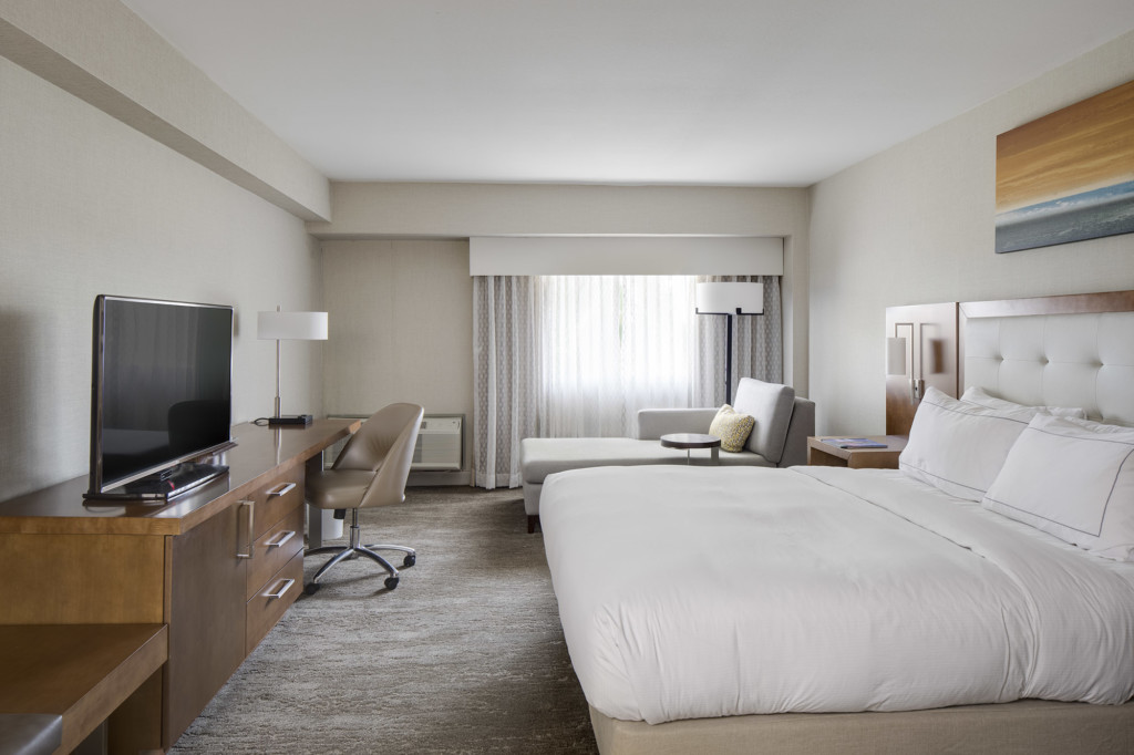
The original rooms had not been updated since the hotel’s opening in the 80s and were dark with heavy drapery and traditional dark wood. Our team brought a sleek update to the suites with lighter tones of wood, one desk unit in place of several heavy pieces of furniture, and additional seating that doubles as a luggage rack closest to door and closet. In the larger rooms Chaise lounges are included for an added place to relax and work with additional plugins added in the headboard, lighting fixtures, and around the room for easy connectivity.
Large Ballroom
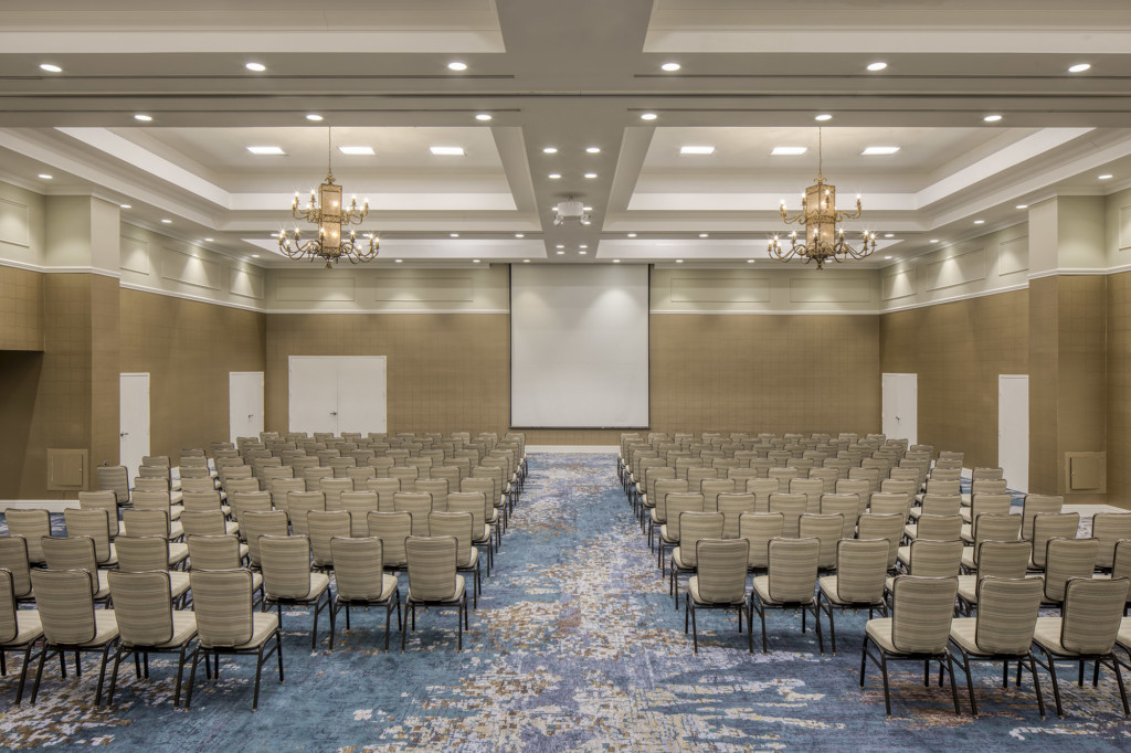
For the ballroom renovation we incorporated new carpet, a consistent pattern wallcovering and single paint color with new furniture for a fresh new look. The hotel’s large ballroom can be divided into four smaller meeting spaces.
