FFKR’s Graphic Design + Marketing Studio has designed custom artwork for multiple clients.
250 Tower Lobby
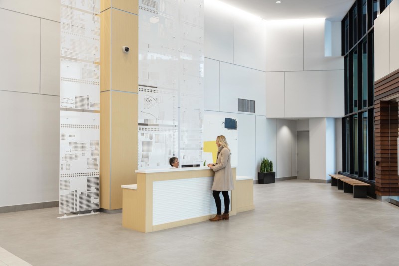
FFKR’s Marketing + Graphic Design Studio designed a custom piece for the lobby reception area. The floor-to-ceiling metal panel is cut to follow a map of downtown Salt Lake City. 250 Tower’s unique building footprint is cut out as a solid shape.
Museum of Natural Curiosity Hub
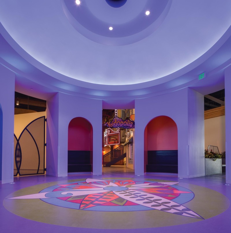
The floor design of the Hub is a compass rose, which incorporates the themes of each exhibit. The Hub embodies the concepts of connectedness and journey.
Davis County Library – Kaysville Branch
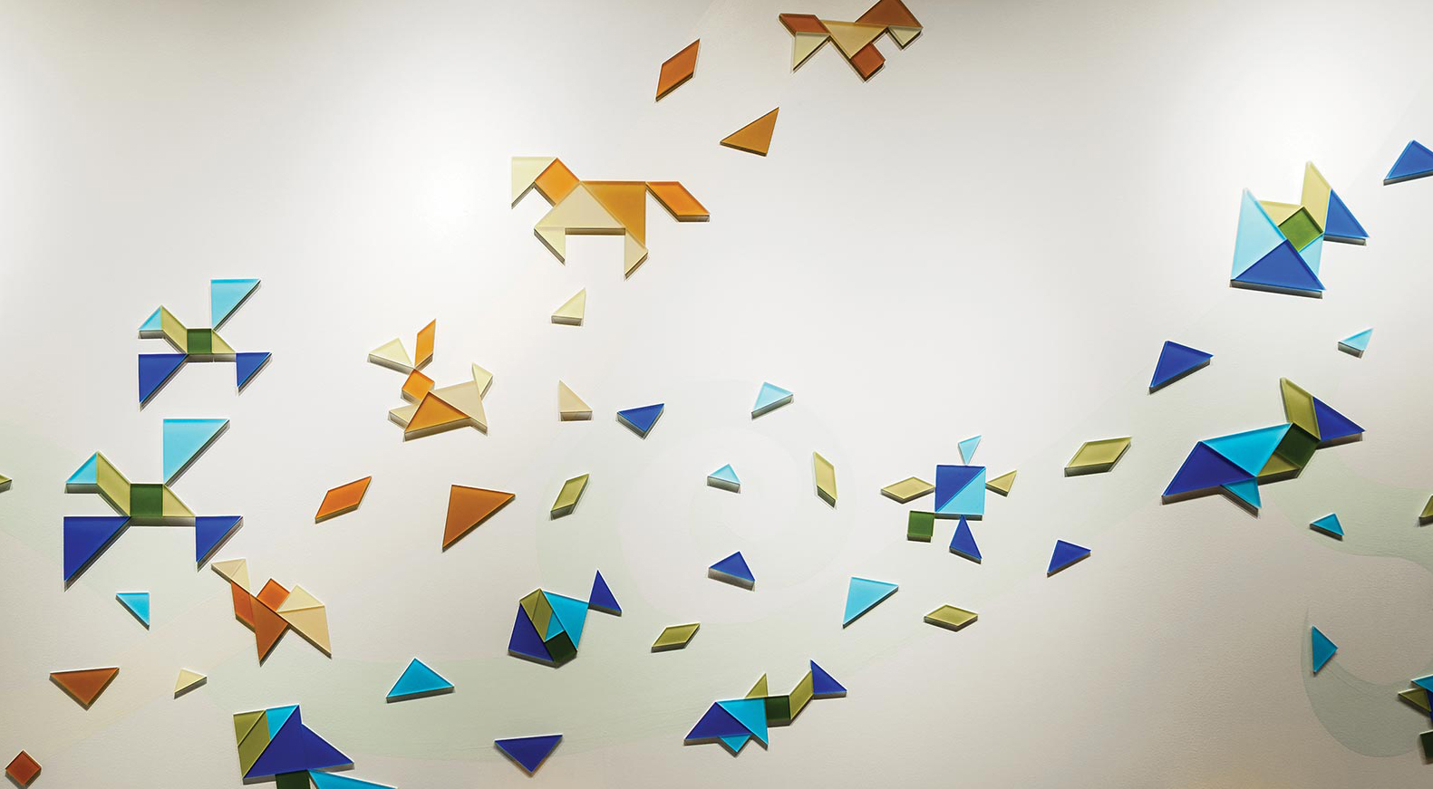
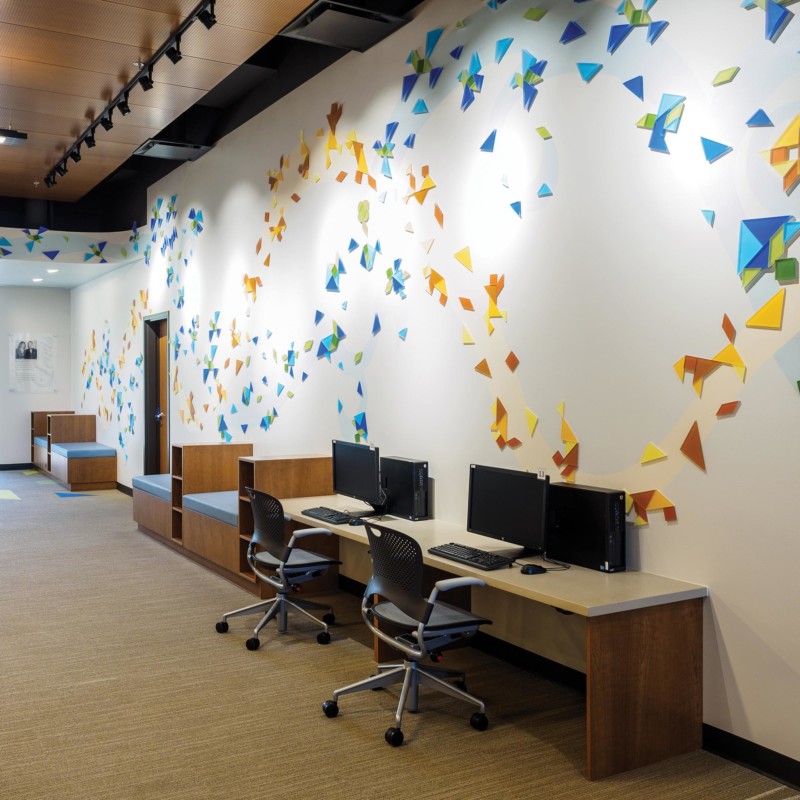
Working closely with the Kaysville Branch design steering committee, a custom art installation was created for the Children’s Reading room. Tangrams are a central design theme and used throughout the building and library printed collateral. Tangrams are arranged by land animals (tan and gold shapes), and air and sea animals (blue and green shapes).
University of Utah Hospital Expansion
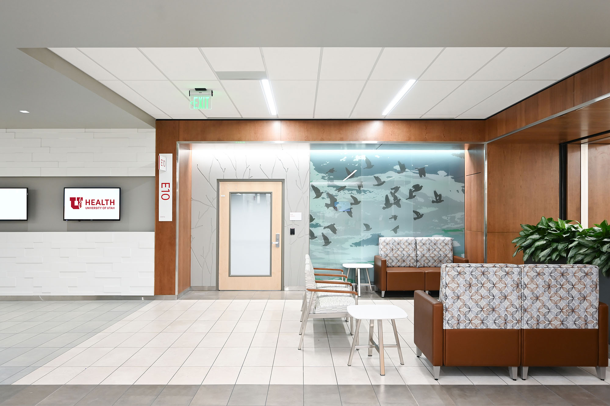
The graphics found throughout the Hospital Expansion act as an indicator of space, and to provide meaningful, beautiful, and effective wayfinding. These images correlate with the interior finishes, to ensure thoughtful continuity and consistency, as well as interest, as a patient and their family move throughout the building. The differing themes and monochrome color pallets of each design serve as an indicator of the different clinic fronts. Lavender, leaves, flowers, water, grass, forest, mountains, birds, and rocks are the designs that make up the collection at the Hospital Expansion.
McKay Dee Pediatric Inpatient
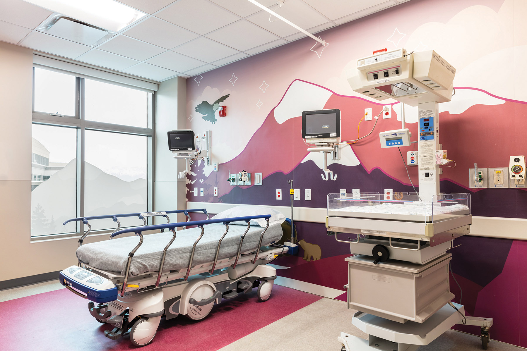
The graphics are an essential element to the design, creating a whimsical and playful environment in an otherwise stressful, anxious, and foreign situation. These designs and graphics help to establish place, giving young patients the ability to recognize their locations, as well as inspire hope and an attitude of ownership. A tie-in to the architectural finishes allows the design to feel cohesive and intentional, to usher the children, their families, and the providers, to feel comfortable in a space created specifically for them. One challenge of this project was to coordinate existing conditions, equipment locations, and technology with the design of the graphics; this required diligent study of every outlet and medical gas locations, so that a seamless integration could be achieved. The ocean, wilderness, and city graphics were themed accordingly; to help the patient and the patients family feel more comfortable.
