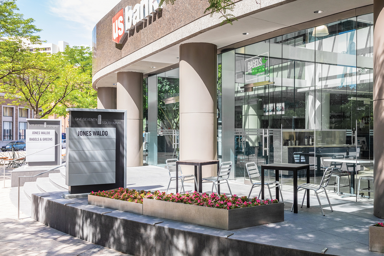
The 170 South Main project is an extensive tenant improvement of the US Bank Building in downtown Salt Lake City. The project focused on the public spaces that the tenants and their clients used everyday. FFKR worked with them to review options that would affect not only the interior spaces, but the exterior presence of the building as well. The project consists of a new fitness center, new restroom and locker room facilities, new entrance vestibules and new façade treatments on the exterior. While respecting the original architecture, the project helps make the building fresh and current.
Working closely with the client, FFKR’s Graphics and Marketing Studio developed an updated logo and signage package for 170 South Main. We researched the history of the property, held visioning sessions with the building management, and designed a logo family that is functional and represents the buildings high standards. A complete signage package for the core building areas was designed using the logo as a guide.
Full of Light
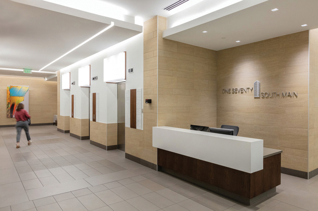
The goal of this project was to create a lobby and entrance experience for the guests and tenants that was full of light and welcoming. By reconfiguring the corridors and building entrances the circulation on the entire main level was improved. The lobby spaces went from dark tile floors with heavy wood panels to a light material palette with simple wood accents.
Gathering Place
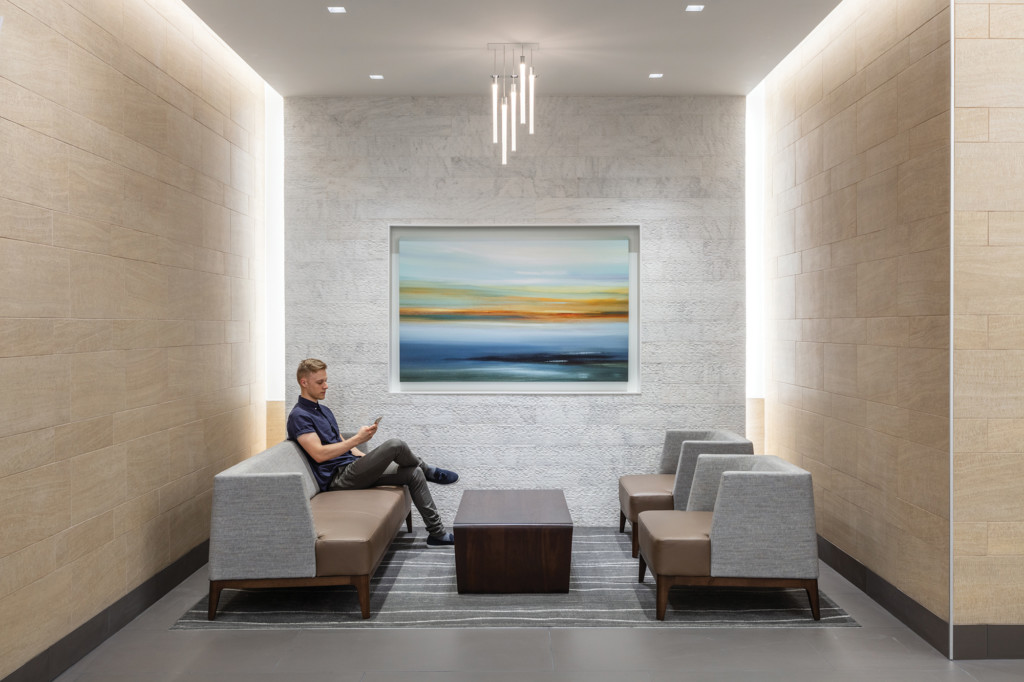
Seating nooks off the main corridors create a gathering space to wait for meetings or take a break from your daily routine. Soft ambient light from behind the feature wall and ceiling cloud create a calming affect within this space.
Main Street Entrance
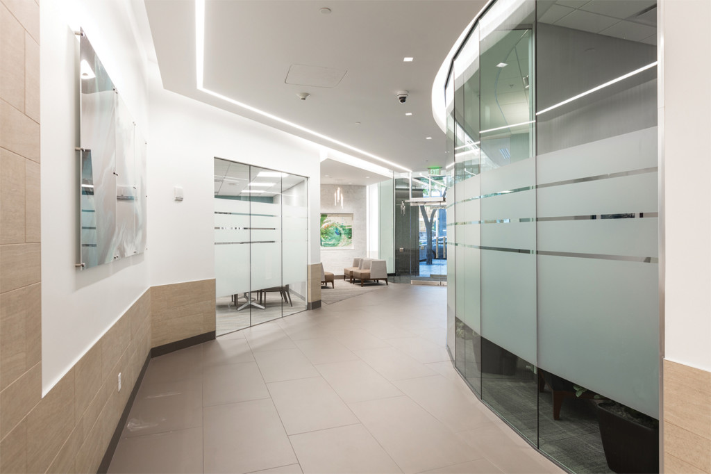
In addition to the updates to the elevator lobby, the entrances into the main level suites were reconfigured to be oriented to the main corridor. A floating ceiling cloud with a simple stripe of recessed lighting follows the main corridors and connects the entrance from Main Street to the 200 South and Main corner entrance.
Fitness Center
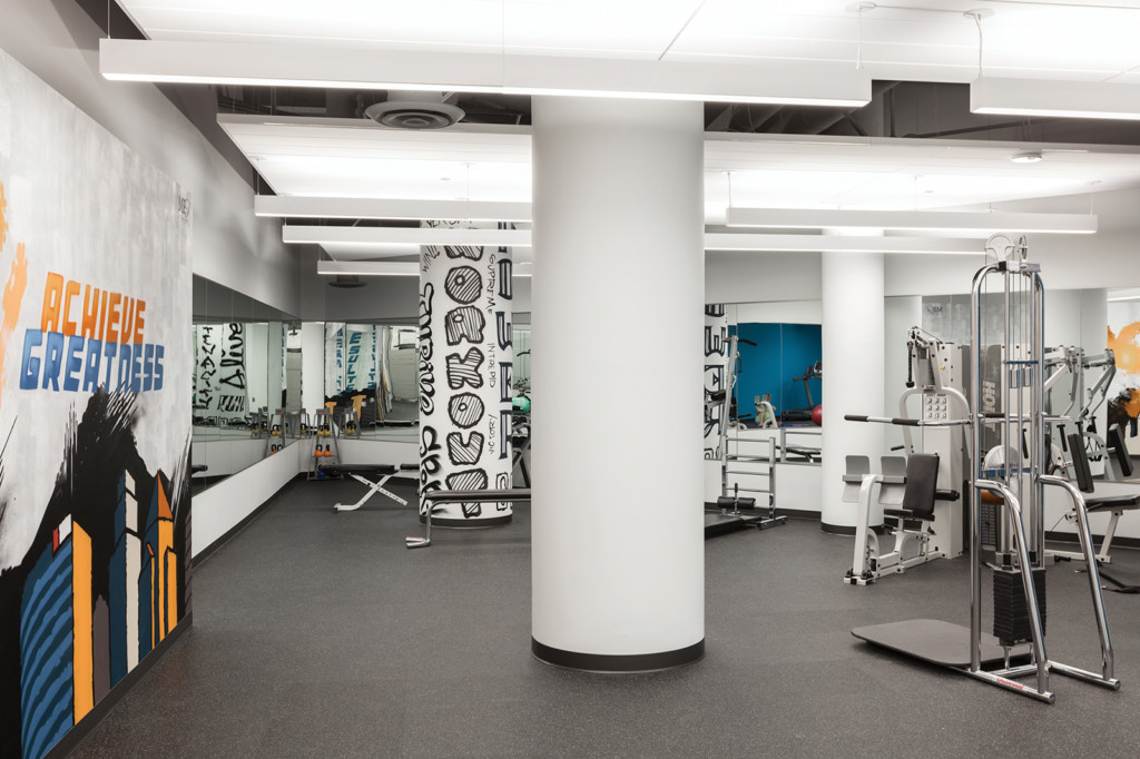
The new fitness center provides tenants a clean place to release their daily stresses. A local artist was engaged to provide graffiti style art throughout the space which was custom developed for the building.
Sophisticated Elevator Lobby
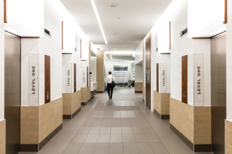
The elevator lobby went through a big transformation to become open, light and simple. Light boxes over each elevator entrance and the light shelf provide a glowing affect throughout the space. Small wood accents add a level of sophisticated detail to items throughout the lobby.
Holistic Design
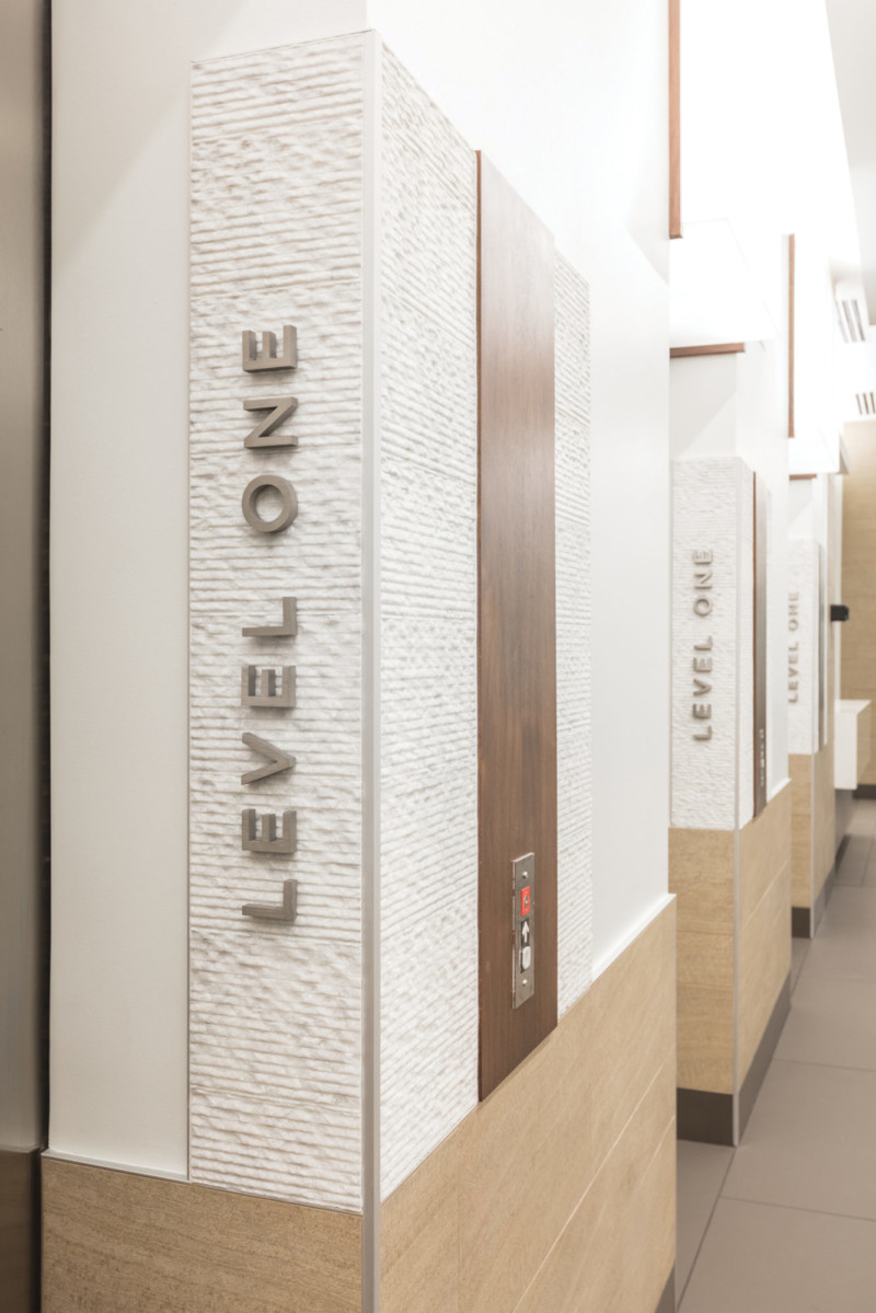
A mixture of textures and materials greet you as you pass through the elevator doors. Each material in the elevator signage is used throughout the lobby to tie everything together as a holistic design.
