Design Incubator is a monthly creative event, sponsored by FFKR’s Professional Development Committee, meant to spark creativity with a unique challenge every month and provide a forum for discussion and collaboration. Senior Associate, Heidi Nielsen led “Emotion of a Word” with a quick definition of typography and examples of its use. The challenge to participants was to use and manipulate typography to show the meaning or emotion of a word. See all the creative concepts below.
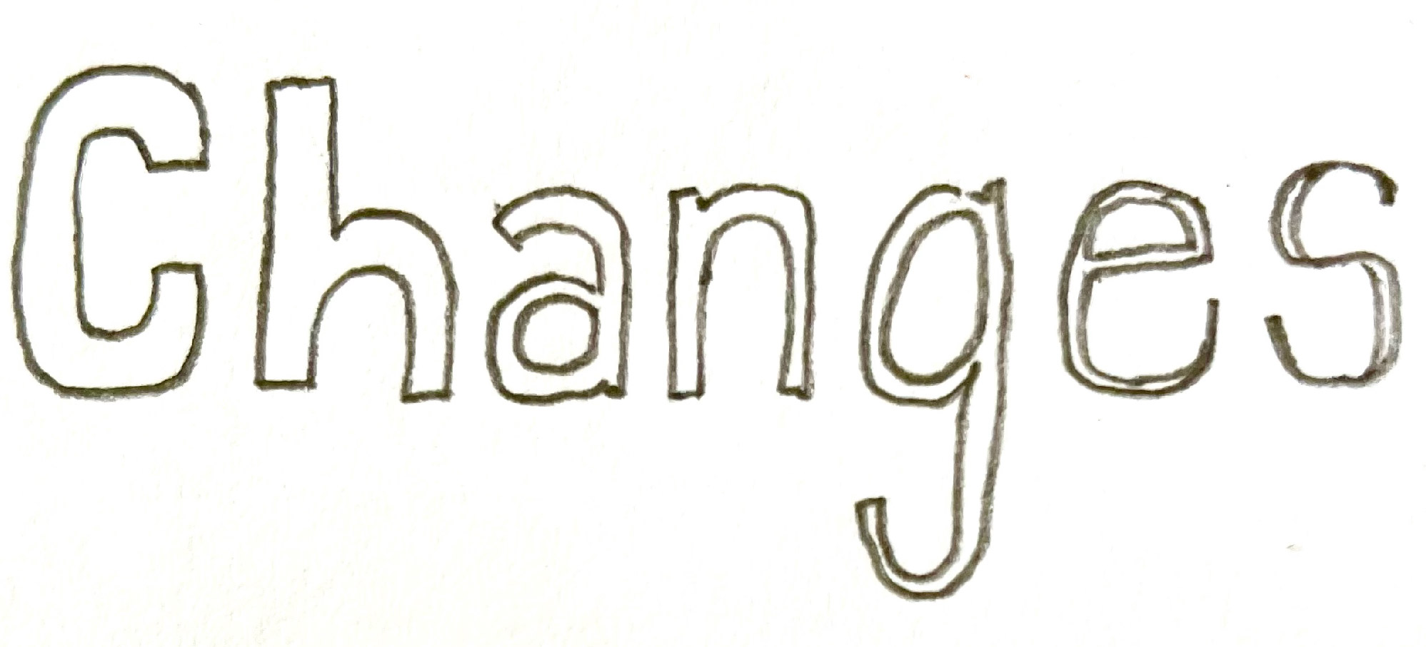
“Change can be subtle. You might not notice it from one step to the next. Sometime it’s for the worse but hopefully for the better.” — Manon
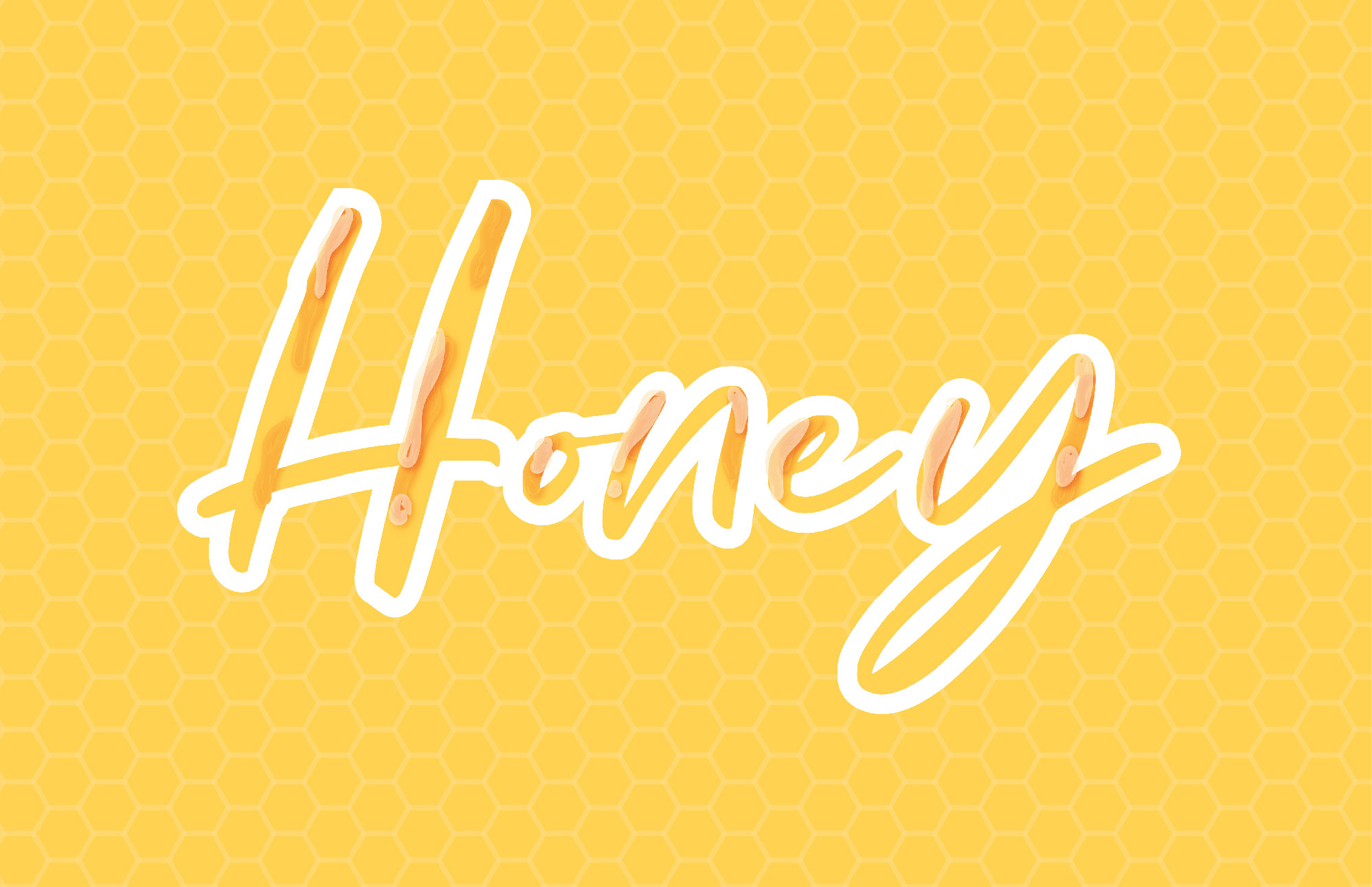
“The emotion of this word, “honey” is visually represented through type, color, and texture. By incorporating the subtle beehive pattern in the background and more visually prominent drips of honey on the typography, it gives the word a tactual quality.” — Meghan
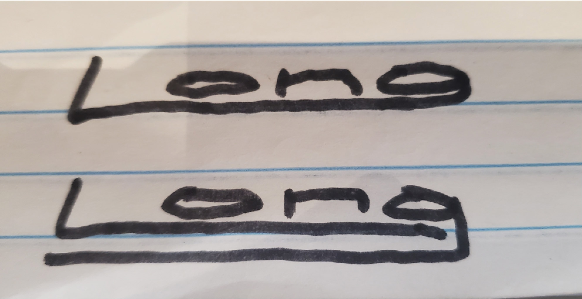
“Did a little thing with “long” because I like how in sign language you can take and modify signs to reflect more of its meaning, in this case, signing long usually is just finger across your other forearm, but to emphasize the length, can go further up your arm and even across your head and flip over to the other side… likewise I did the word in text this way.” — Ben
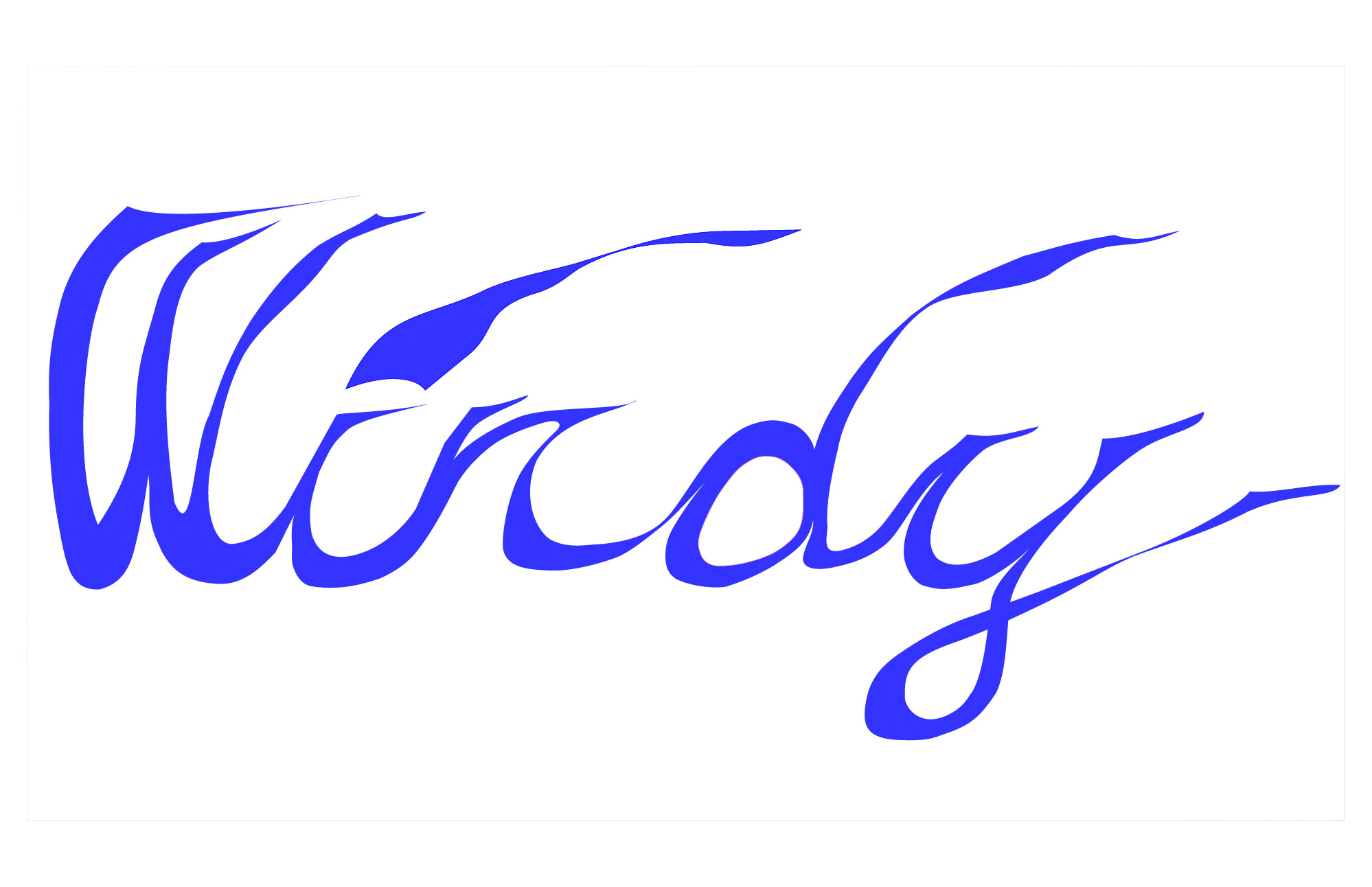
“Wind is often ephemeral to our senses, yet a distinct and real part of our world. To illustrate this, I first took a script font, as I wanted to imitate the flowing nature of wind. Then, I took the form and tweaked it, giving the letters a modulating width with exaggerated serifs following the flow of the script to give the feeling of movement, emphasizing the action that wind takes on in lieu of the basic noun wind. I chose the dark blue color to indicate a solid presence and to represent the aspect of wind that makes it both desirable and dreaded; the chill experienced with most breezes.”
— Trent
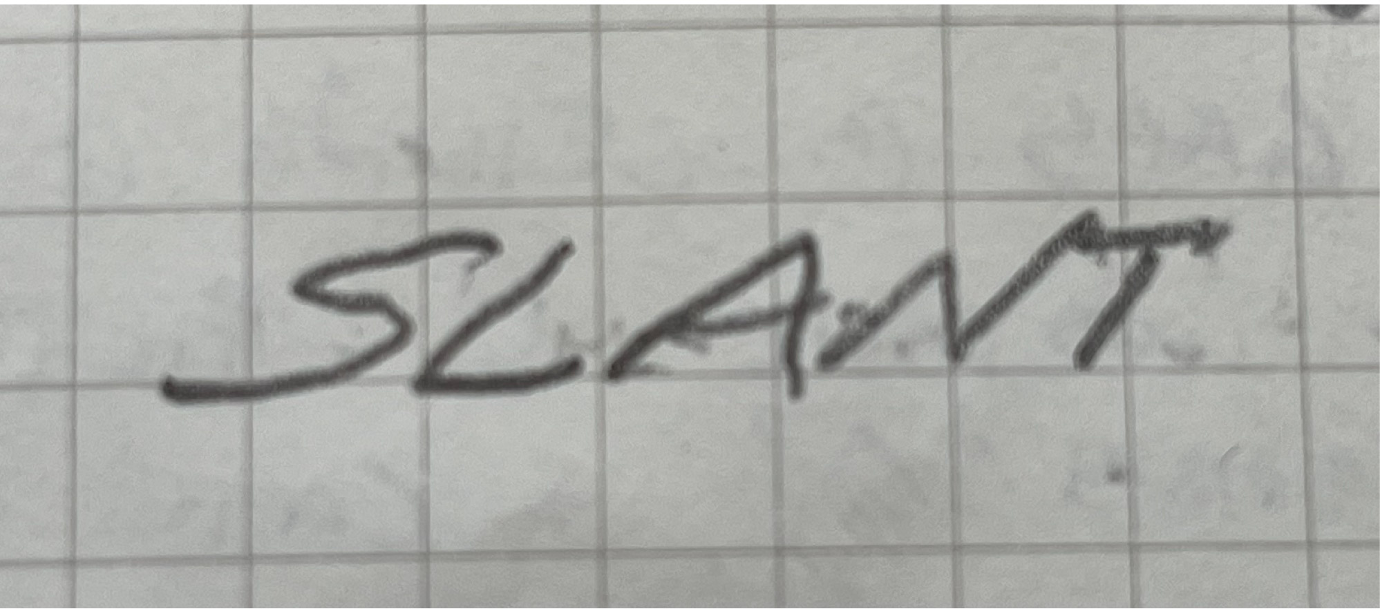
“The word SLANT shown here is not italicized, but over emphasized to be almost falling over.”
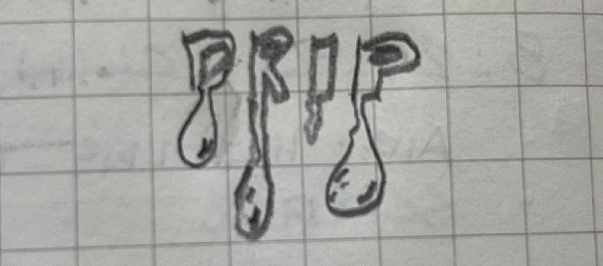
“So, for whatever reason, I thought it would be fun to try something like DRIP to appear almost wet.”
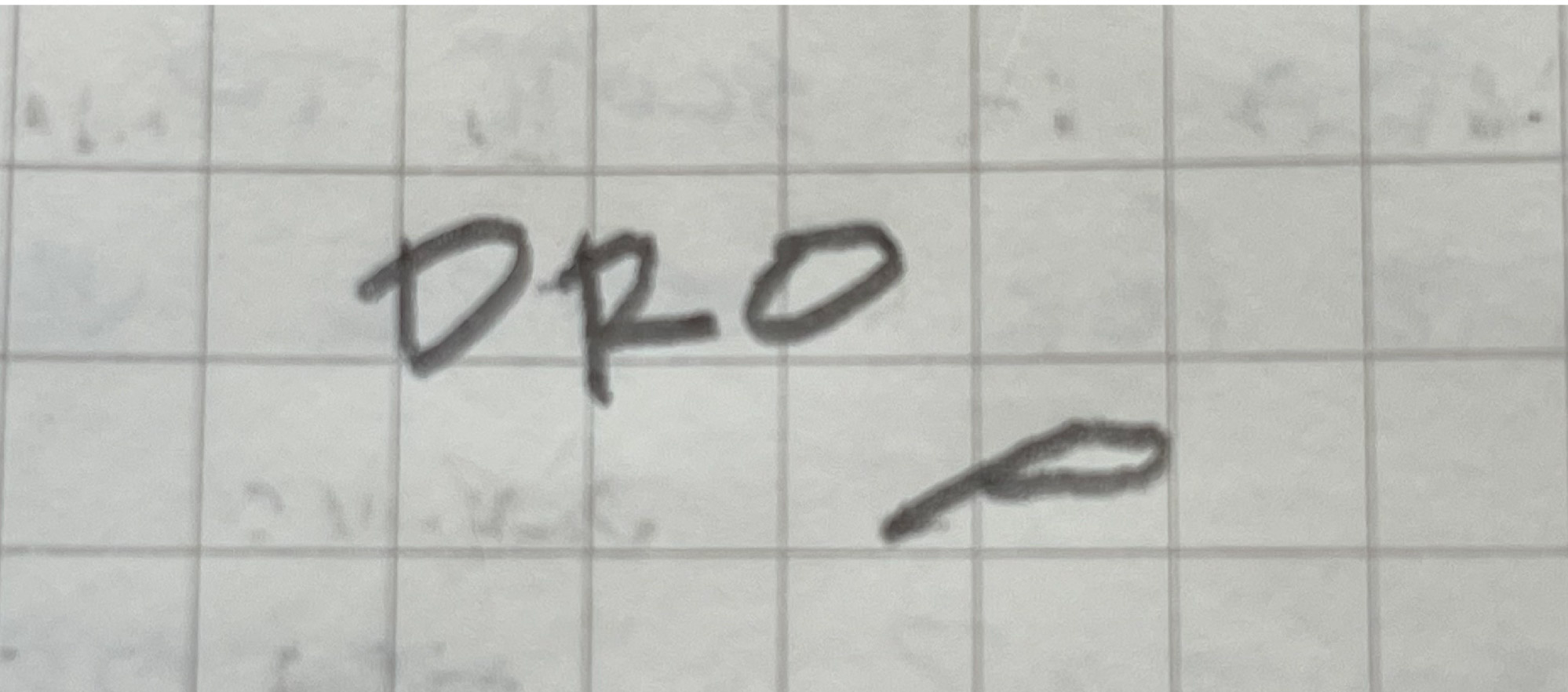
“Looking at these in the sketchbook, thinking and combining the two the word DROP might want to look something like this.” – Chris
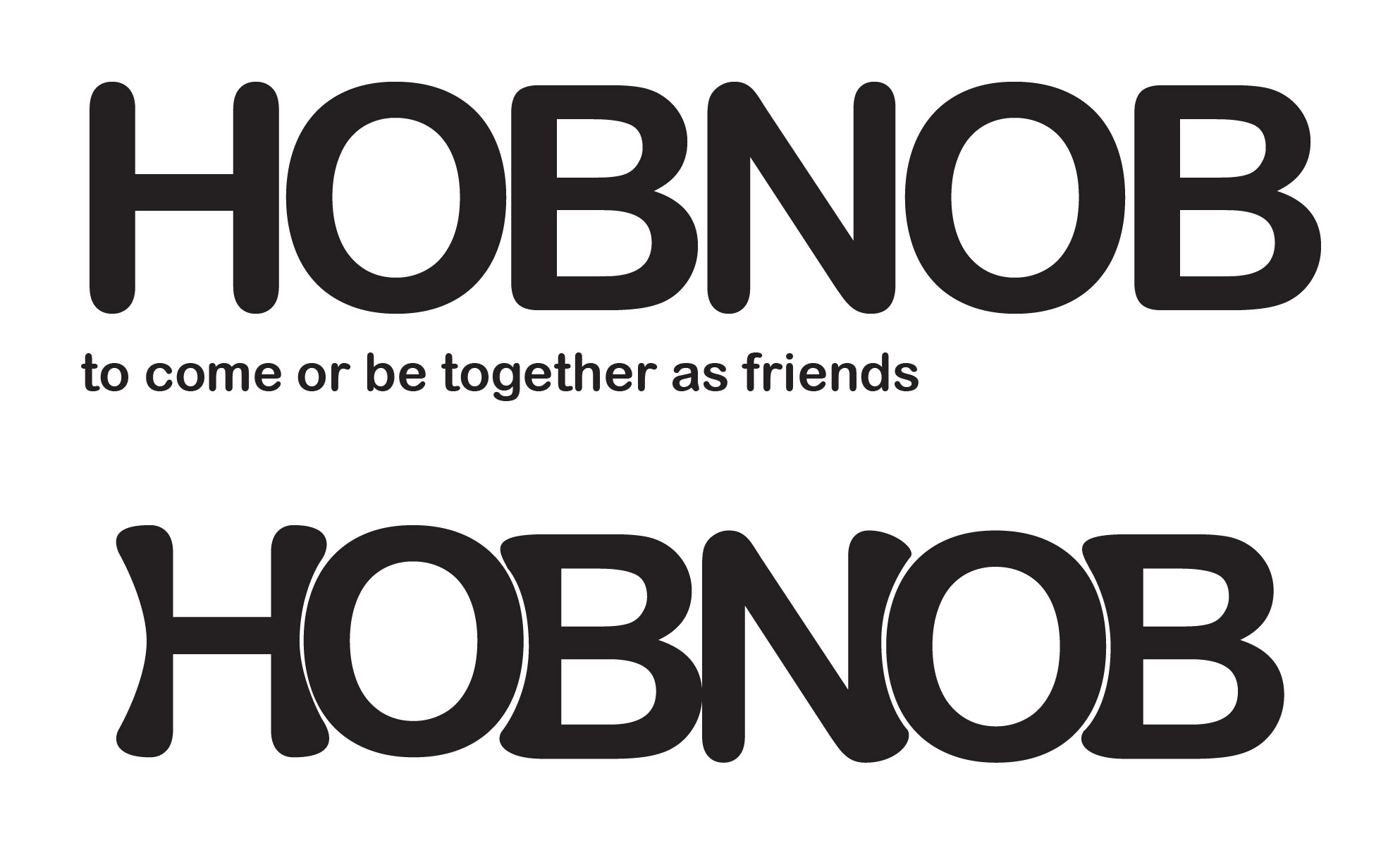
“I started by looking at the Websters Word of the Day. For this particular day, it was Hobnob, which means to come or be together as friends. I chose a font that looks friendly with soft elements and rounded letters. Manipulating the forms to come together and start to embrace the letter O begins to show the meaning of Hobnob.” — Heidi
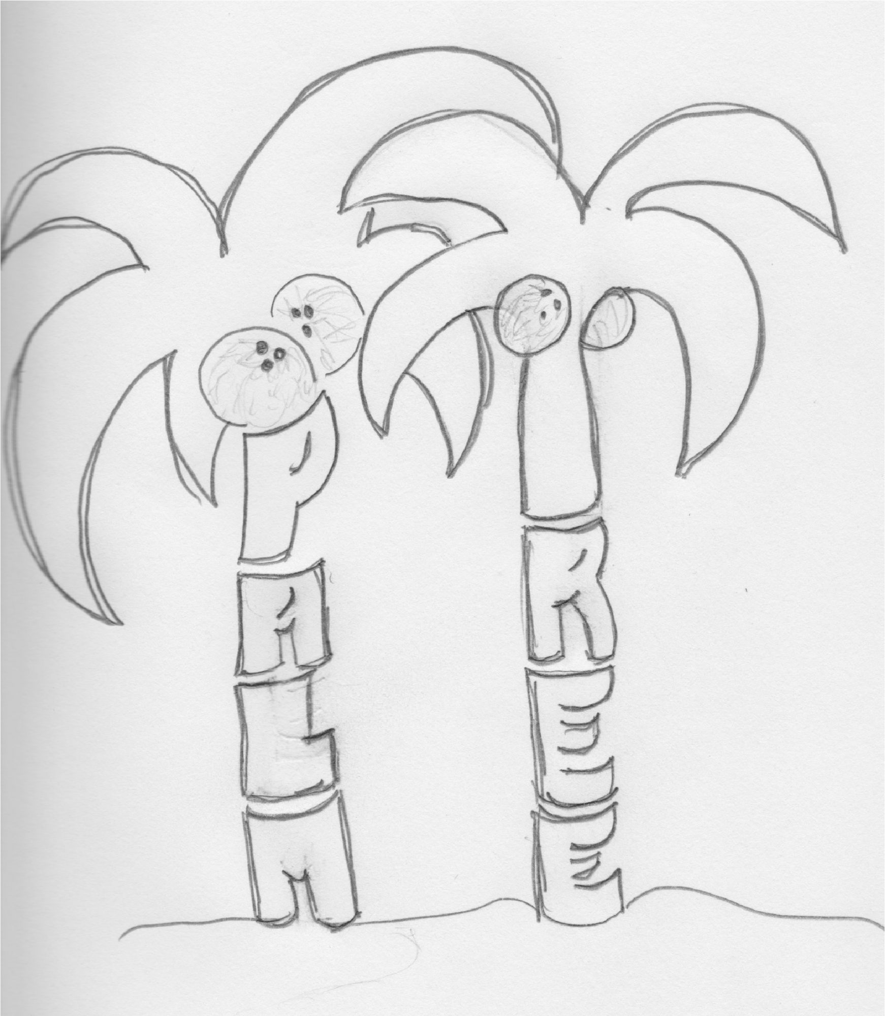
“Using the letters of the words ‘palm’ and ‘tree’ as building blocks to create a shape and structure that visually portrays the meaning of the word.” — Roxy
