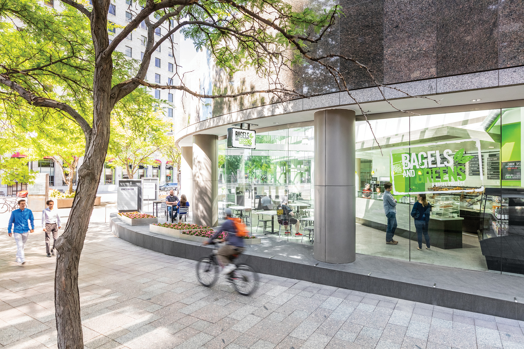
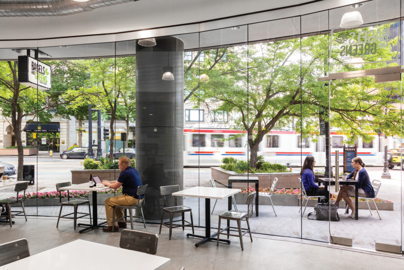
As a sister restaurant for The Bagel Project, the Bagels & Greens design centers on their unique branding with elements carried through from their first location. A large glass wall faces Main Street in downtown Salt Lake City allowing patrons to enjoy the views and passers by to see the activity within.
Downtown Location
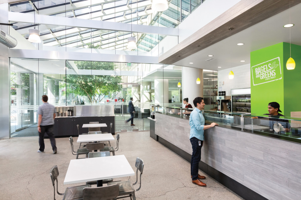
Bagels and Greens wanted to develop their second location in the center of downtown. The corner of Main Street and 200 South was the perfect choice. The project uses the green accents to catch your eye as you are walking by.
Open and Transparent
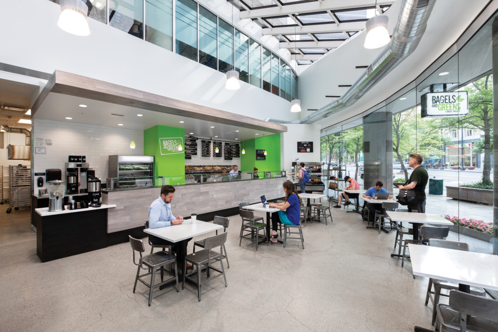
The full height glass on the exterior wall make the entire space very visible from the street and sidewalk. The glass ceiling in the dining area creates a dining space that is enjoyable year round.
Attention to Detail
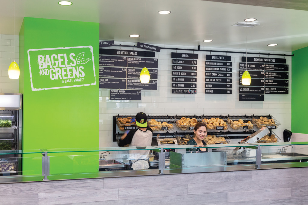
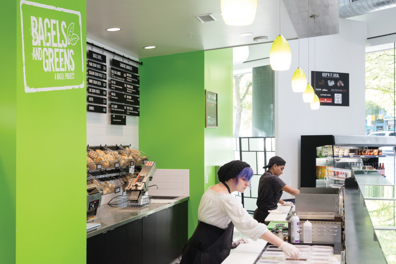
Detail elements on this project were a collaboration between the design team and the owner’s circle of friends. Metal craftsman were brought to the team by the owner to create the custom menu items and glass food guard. All the details were coordinated and developed to tie into the built in items such as the service counter.
Bringing the Outdoors In
Outside of the space there is outdoor seating on a raised platform. It allows you to enjoy your meal outdoors but still have a separation from the pedestrian traffic. The barrier free visual between the interior spaces and the exterior spaces blur the connection to almost make the sidewalk an extension of the space.
Materials
Black plate steel was a material that various ways in the millwork and other items. The contrast between the black steel and the stainless steel create a material palette that is clean and crisp. It also contrasts nicely with the green accents and most importantly the bagels.
