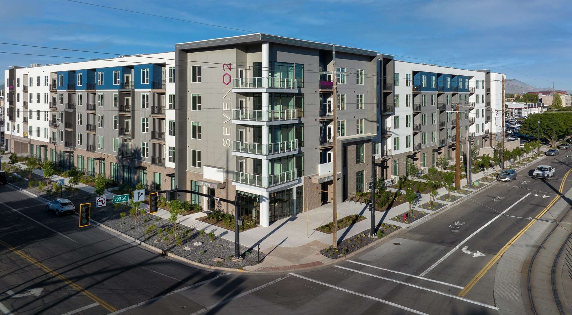
FFKR’s Graphic Design + Marketing Studio designs logos and branding guides that are unique to each client.
FFKR Architects Logo and Brand Guide
FFKR’s Graphic Design + Marketing Studio was tasked with designing a new logo identity, business collateral, and establishish brand guidelines for one of the toughest clients, ourselves. Working with a small committee, we began by researching FFKR’s logo identity used throughout the years. Inspired by fonts used during FFKR’s founding in 1976, a new look and identity were established, that respects the past while moving towards the future. We implemented colors, weights, and shapes to create an identity family that is true to the visual brand across media platforms.
Union Park Logo
Cushman Wakefield manages four buildings in the Union Park Center. FFKR Architects graphic designers worked with the building’s management and owners to create a unified building identity. The primary logo is used for all four buildings. Logos that incorporate the address were created for building signs and individual building identity.
Stratus Professional Center
The Stratus Professional Center needed an updated, exterior, professional signage package implemented quickly. The FFKR graphics team was asked to develop monument signage for the office building in keeping with the professional tone of the facility and organizations housed within. The design solution presents an attractive, logical, understated, modern face that is easy to read and understand, at a reasonable cost to the owner.
250 Tower
We designed a logo family that is functional and represents the buildings high standards. A complete signage package for the core building areas was designed using the logo as a guide.
170 South Main
Working closely with the client, FFKR’s Graphic Design + Marketing Studio developed an updated brand and signage package for 170 South Main. We researched the history of the property, held visioning sessions with the building management, and designed a logo family that is functional and represents the buildings high standards. A complete signage package for the core building areas was designed using the logo as a guide.
