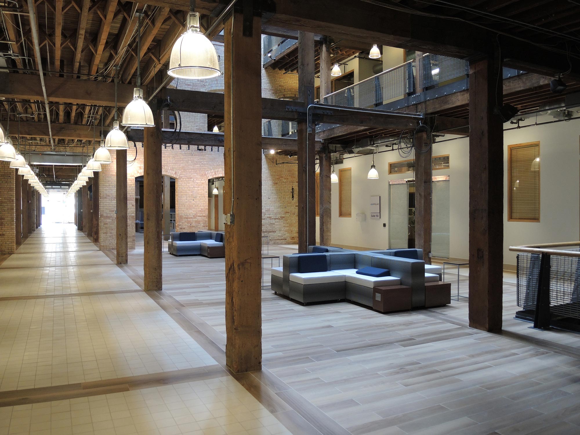
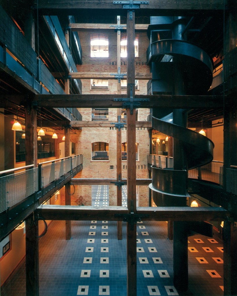
FFKR designed the conversion of a 1909 five-story Salt Lake Hardware warehouse building into a functional, contemporary office building. A portion of the building’s center was removed to create an atrium that brings natural light to the interior of each 50,000-square-foot floor plate. Major circulation is organized around the atrium to provide the greatest amount of flexibility and subdivide tenant space into a variety of lease arrangements.
The original warehouse character has been preserved throughout the building. The exterior windows on the east elevation are original stock salvaged from the three fenestrated elevations. Matching windows are used on the north and south elevations. Care was taken to preserve historic elements such as the rooftop water tower, fire escapes and landings, fire bells, and the south loading dock. Except for a small office area on the main floor, the interior consists of exposed heavy timbered post-and-beam construction with exposed wood decking over the floor joists. The building has been brought up to current code standards, including seismic upgrade and replacement of the entire mechanical and electrical systems.
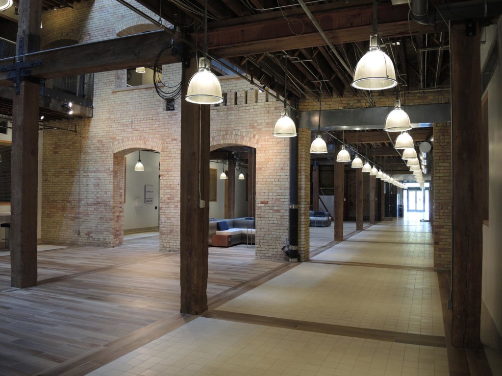
The Salt Lake Hardware building is a historical gem in the heart of Salt Lake City. Originally commissioned with a revitalization in 1996, FFKR was brought on board to refresh and revitalize the common area spaces in 2015. With the integration of technology and implementation of new finishes and furniture, a brighter, more contemporary design was realized. A lighter color palette, rich textures, and metals were implemented to highlight the historical architecture and provide high impact throughout the lobby and shared common areas.
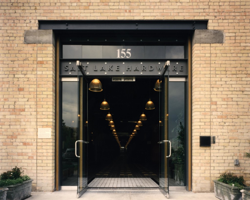
Historic Salt Lake Hardware Building Entrance
At the time of the renovation in the 90s, the entrance was downplayed as a result of the tenant population’s needs. Strong, simple, and stated, this entrance mirrored the aesthetic of the new build-out.
Seeing in a New Light
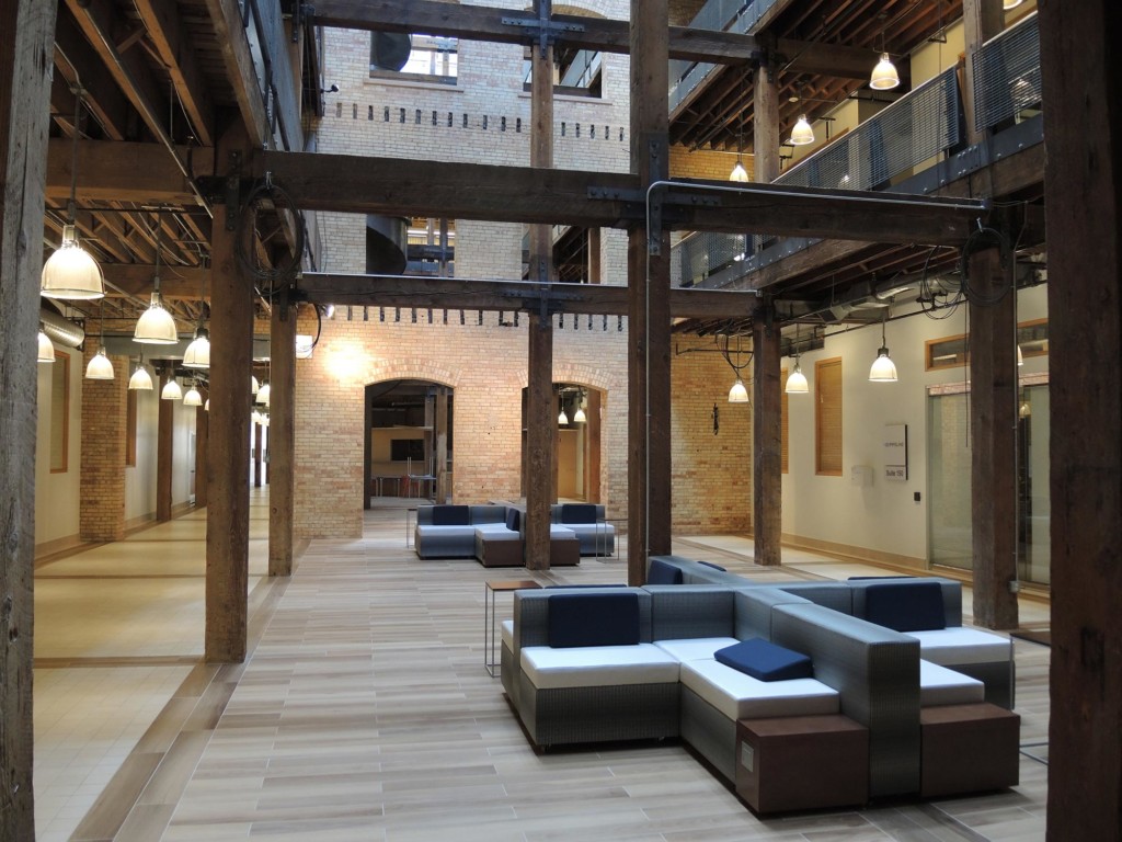
An atrium space was created by removing floors to allow natural light to flood the building, while the vertical brick dividing walls were maintained to highlight the building’s original aesthetic charm and character.
A Modern Refresh on a Timeless Classic
In 2015, an aesthetic update incorporated a brighter color palette, updated LED lamping, new updated finishes, and furniture. This decreased the amount of visual clutter and allowed the history and architecture to shine.
Sit Down, Stay Awhile
New furniture encouraged the building tenants and visitors to rest, work, and visit in the atrium. With the main floor frequently used as an event space, this also required that the solutions be modular, durable, and fit within the desired design goals.
Fun and Games
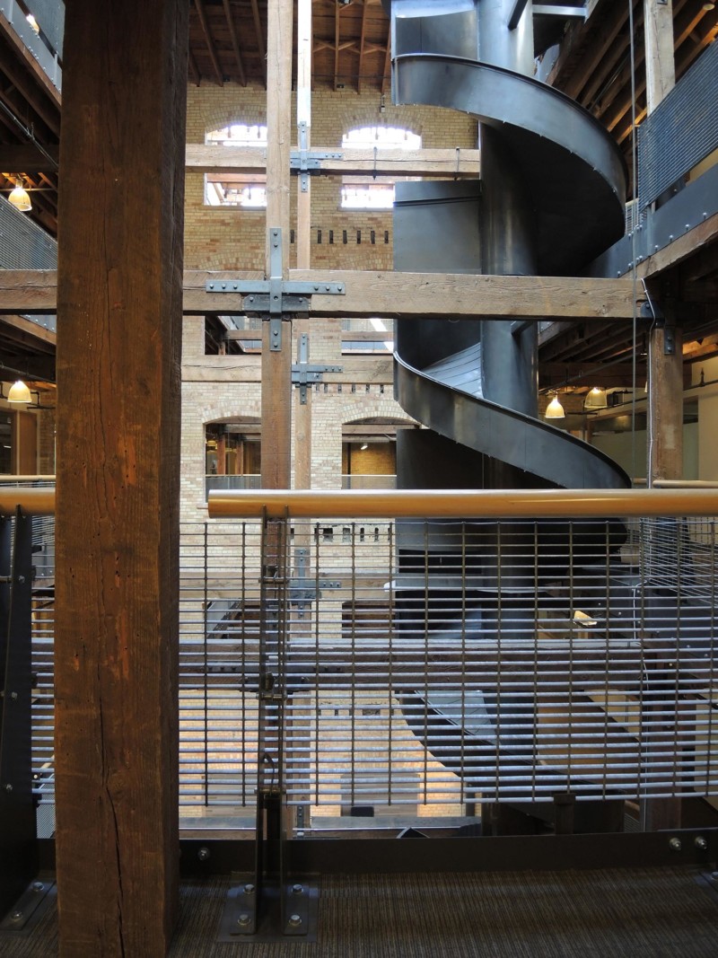
Maintaining elements that were original to the building highlighted the history, such as the slide that once served as a means of delivering goods from the warehouse down to the main floor.
Safe and (Design) Sound
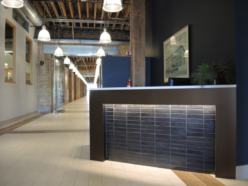
The updated color palette and lighting creates a more welcoming entrance, while providing the desired level of building security. The desk mirrors the building’s strong timber construction, and sets the tone immediately as you enter the building.
